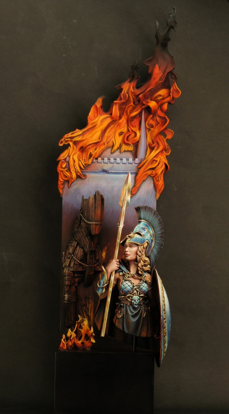
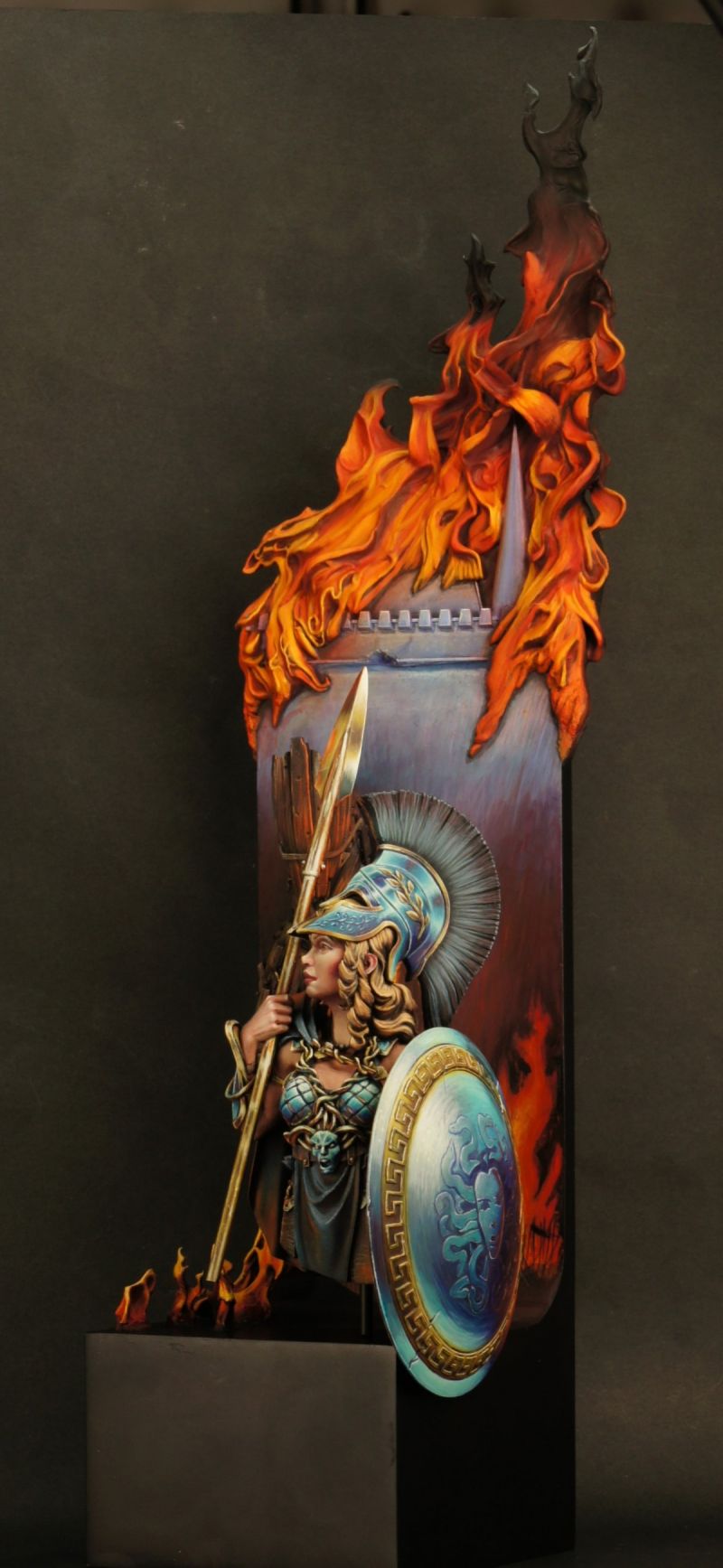
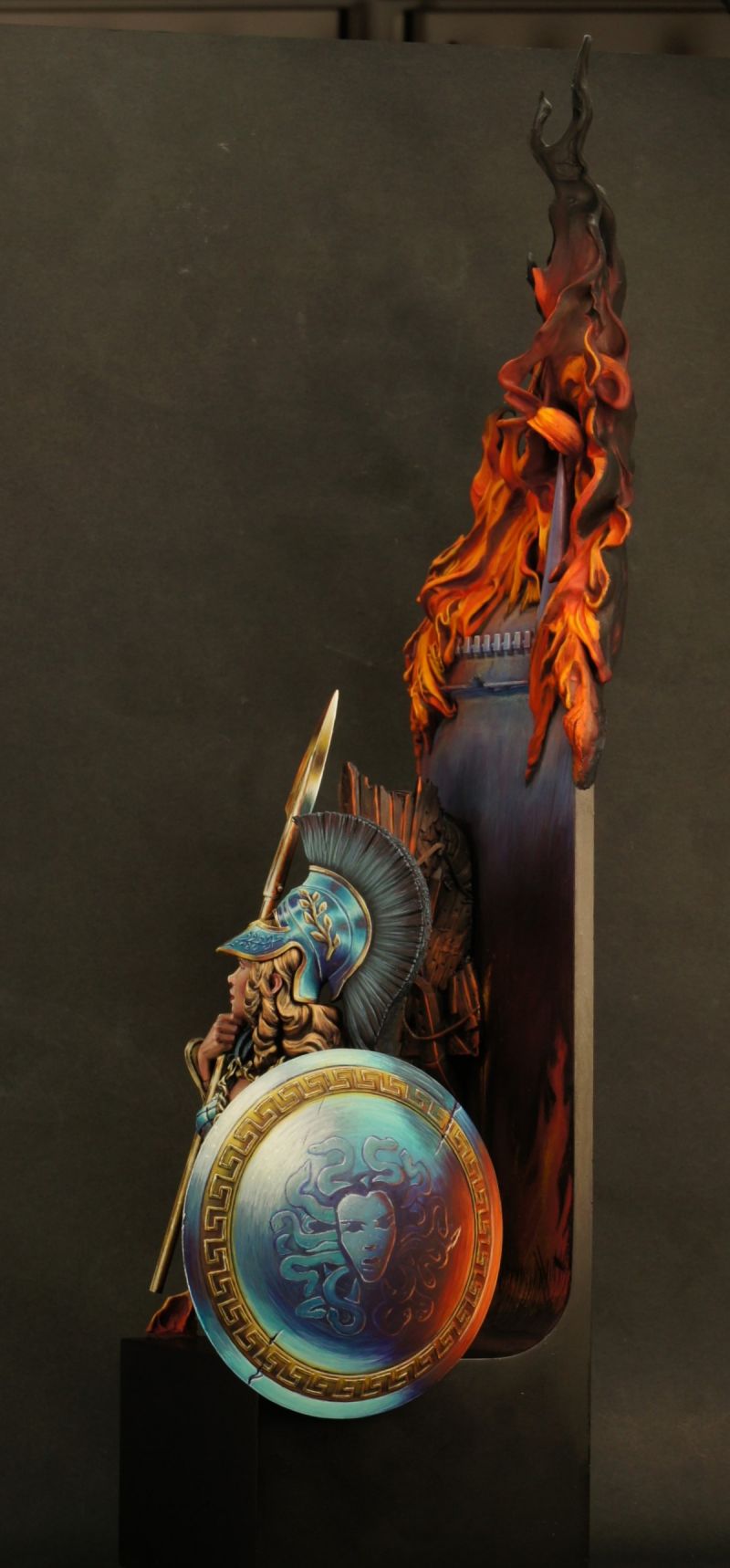
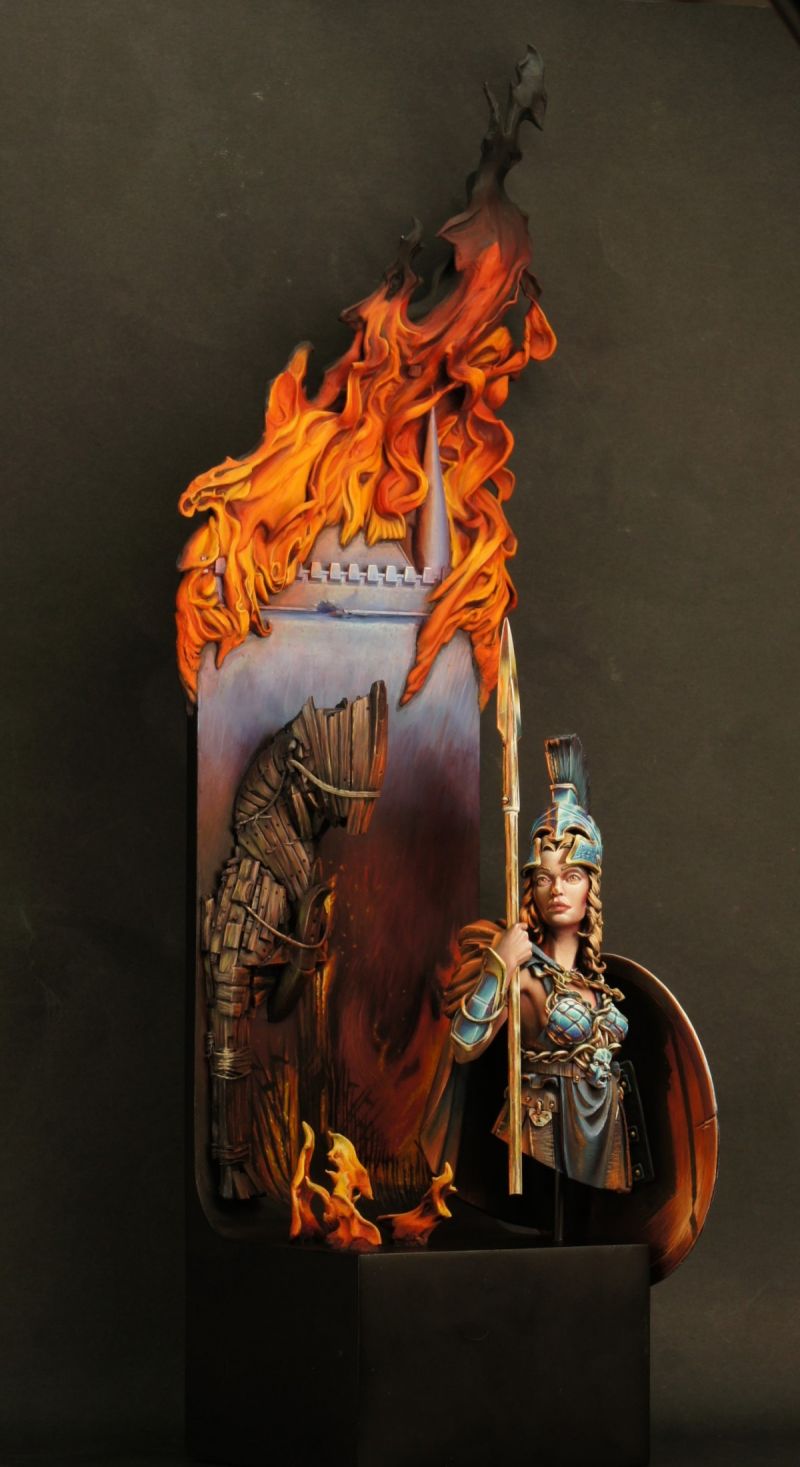
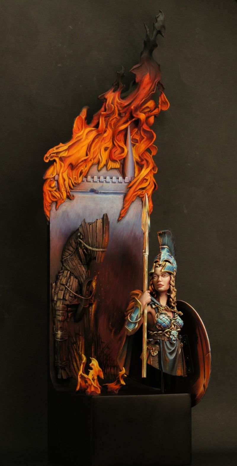
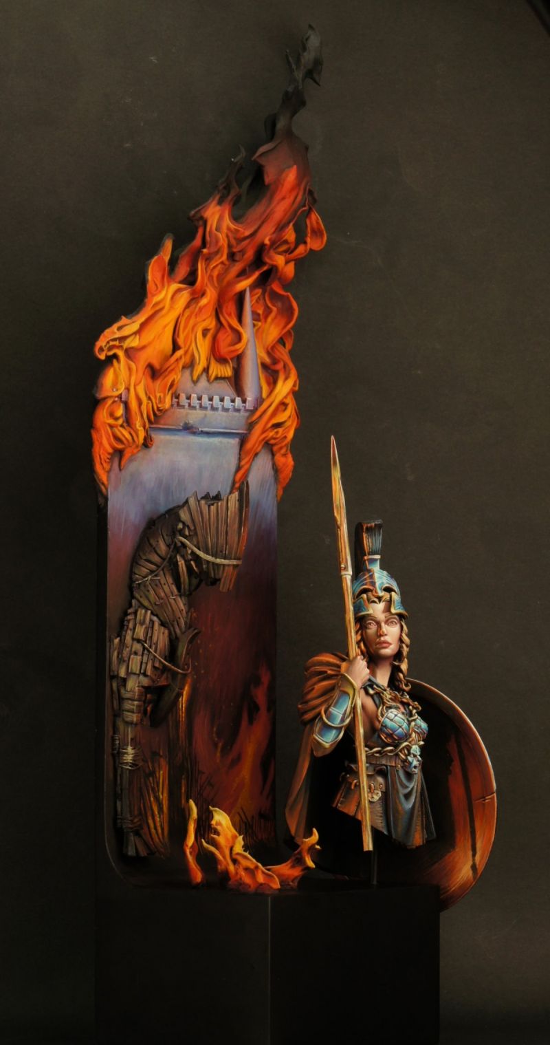
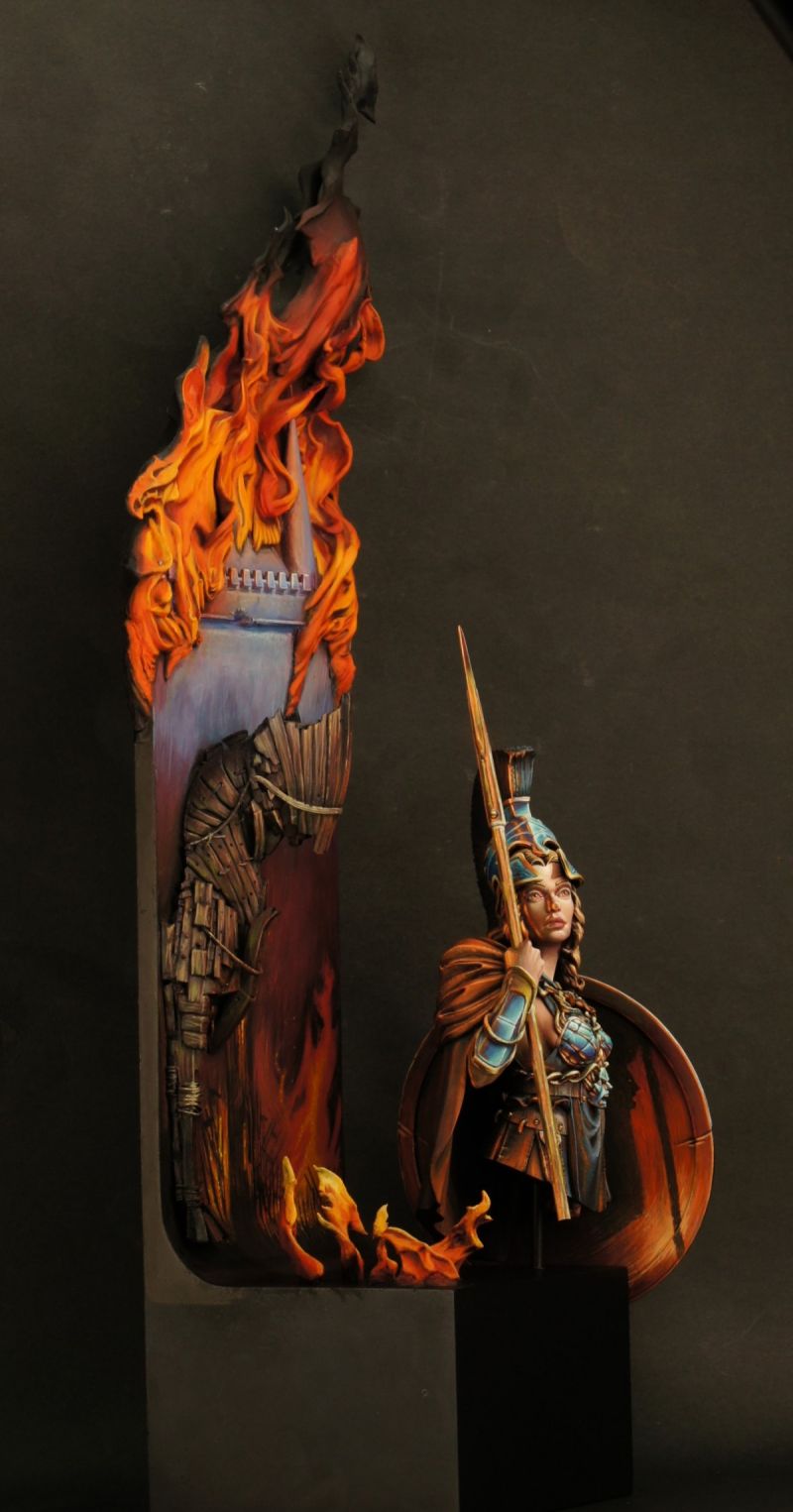
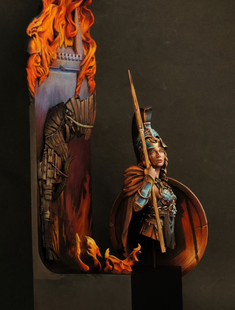
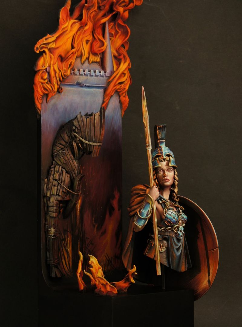
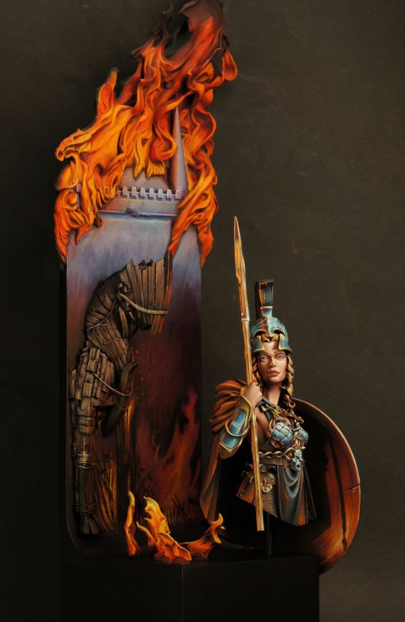
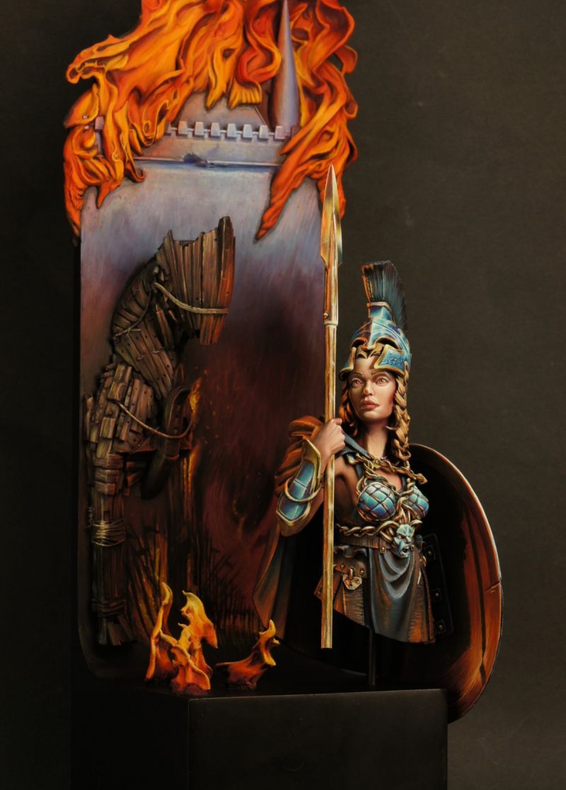
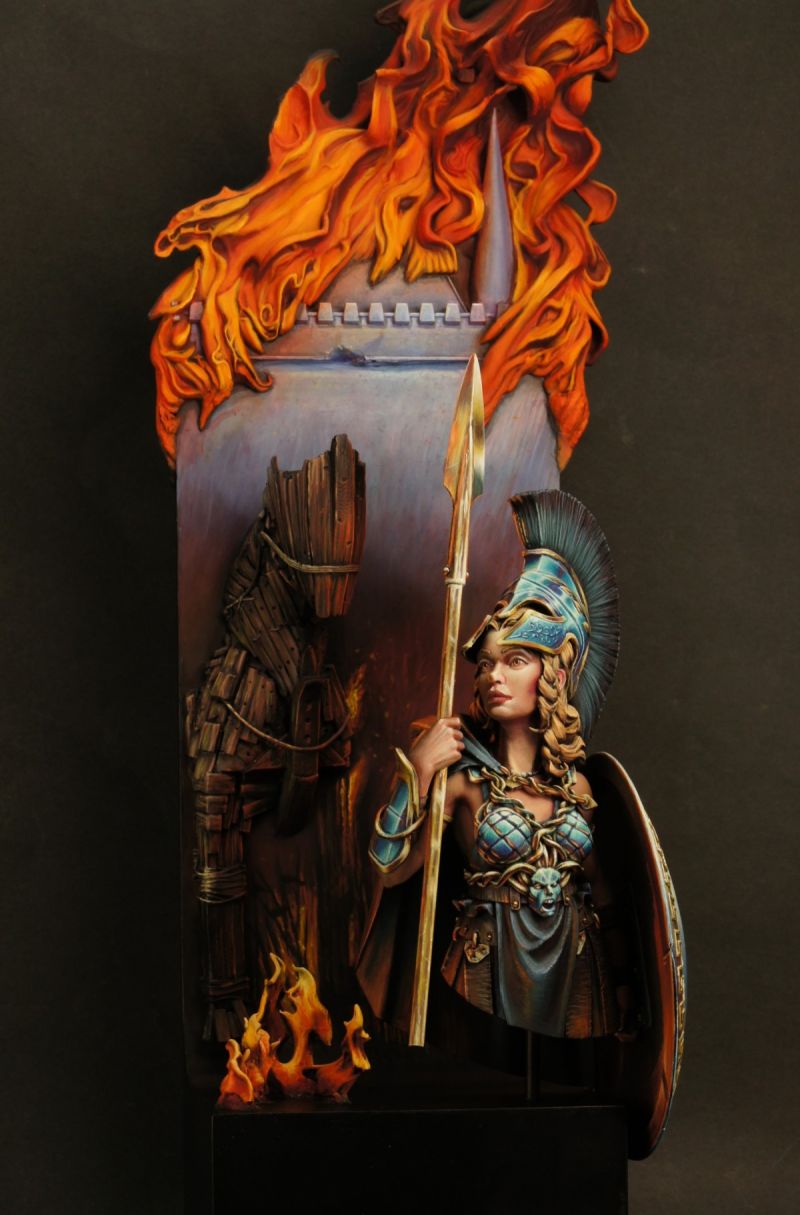
I was able to have a 3d sculptor, Tim Gathercole from the UK, assist in achieving my vision of the battle scene by 3d sculpting the Trojan horse, the fire and castle walls for the plinth so I could 3d print them. Thanks for the help there Tim!!
Aimed to paint the piece with a war torn background (abstract) with lots of fire and OSL on her right side. Also painted a freehand medusa on her shield with lots of effects to simulate fire etc and added in small bits of fire on the plinth to round the piece out. Adding in the cast shadow on the inside of the shield also helped push the effect to sell the piece.
Overall it was an enjoyable sculpt to paint a second time and achieved my vision for the piece.
Thanks to Tim Marsh for all the tutelage and guidance with the piece over the last few months, particularly with the shield and fire/OSL elements. Thanks for Tim Gathercole for 3d sculpting the extra pieces to achieve the vision! Thanks to Benny Layton for providing invaluable feedback on the shield and making me change the original medusa head I had on the shield....this one is much better. Than


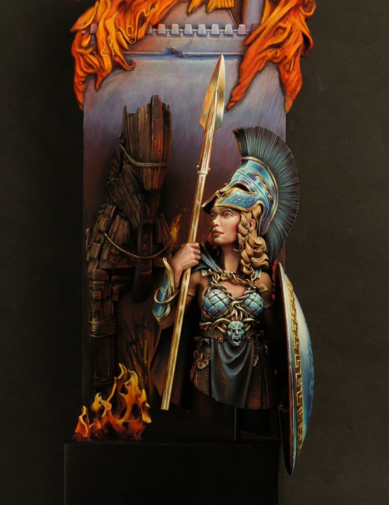
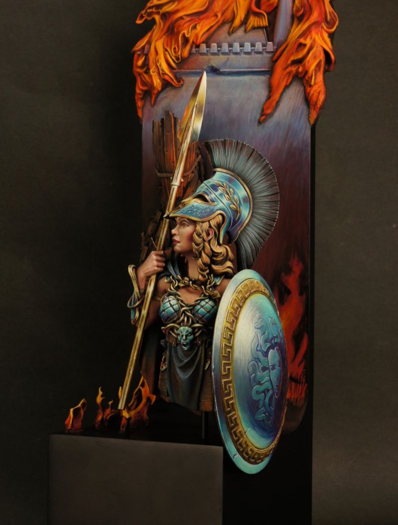
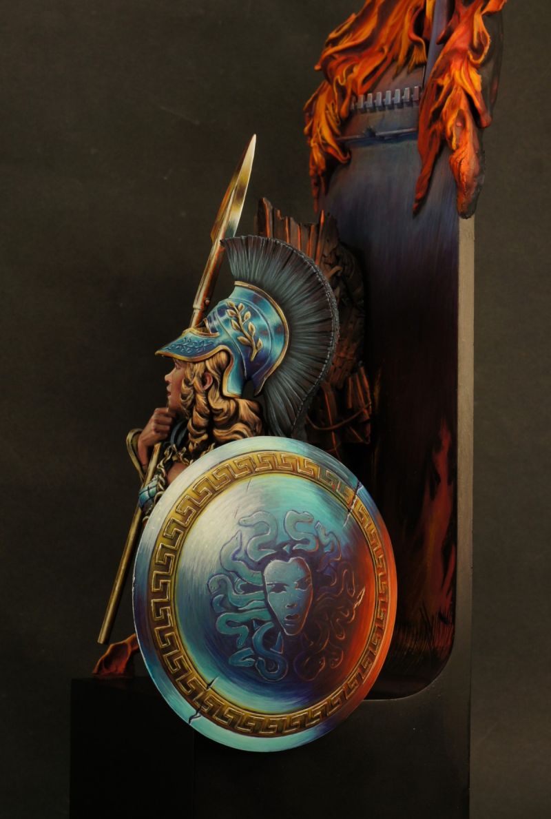
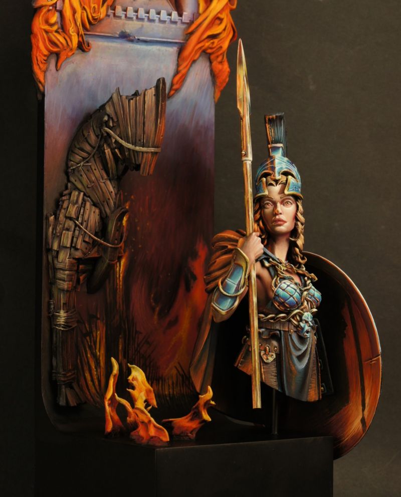


OrigalumPLUS
Let it burn!Fabrizio SchiragaPLUS
you managed to convey an incredible atmosphere, a very difficult model to paint. goldTimPLUS
Your best piece yet dude. It’s absolutely smashing. Gold and EditorsClive Jackson
Fab realisation of this bust...all the work paid off! Gold!Malte Dueholm
Gold gold gold gold gold mateeric wolfsPLUS
Great painting ! Vote GoldRoman LappatPLUS
A very strong piece, Jared. Very cool storytelling and detailed work that went into this. Paintjob and basing is splendid. Really lovely. The only thing that is a little off for me personally is the plinth size. I think it works lovely from the side of the shield, but on picture #7 there is a lot of open space that feels not really good from high-level compositional aspects. Could have all been packed a little tighter, but then maybe on a thighter plinth or even in a frame. Nonetheless it is a lovely piece with tons of work, passion and quality in every inch. Gold and Editor's from my side!Tommy Gunn
You can feel the heat. Gold all the way.