


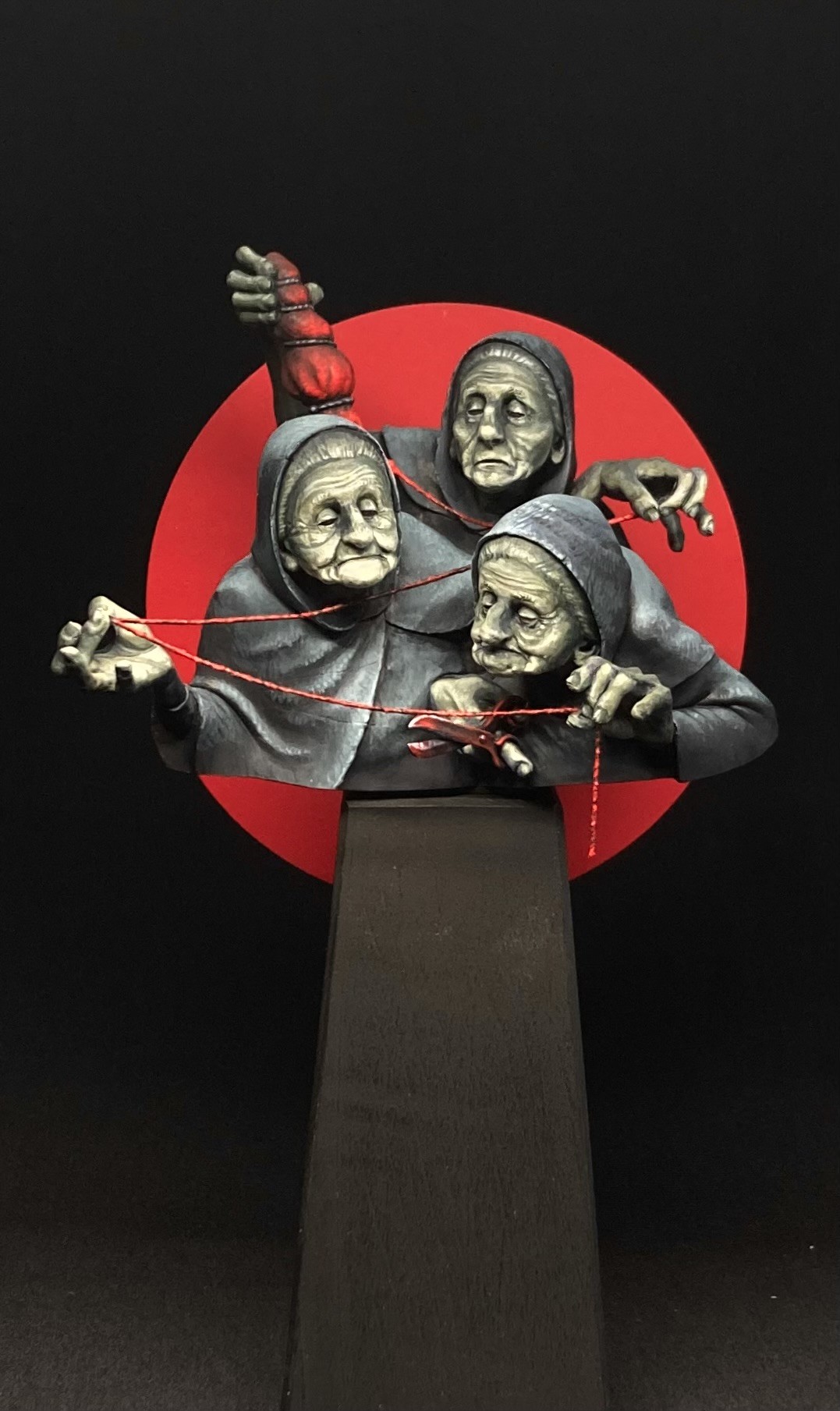
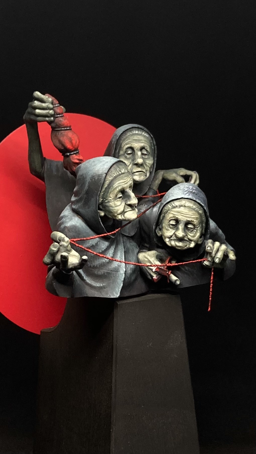
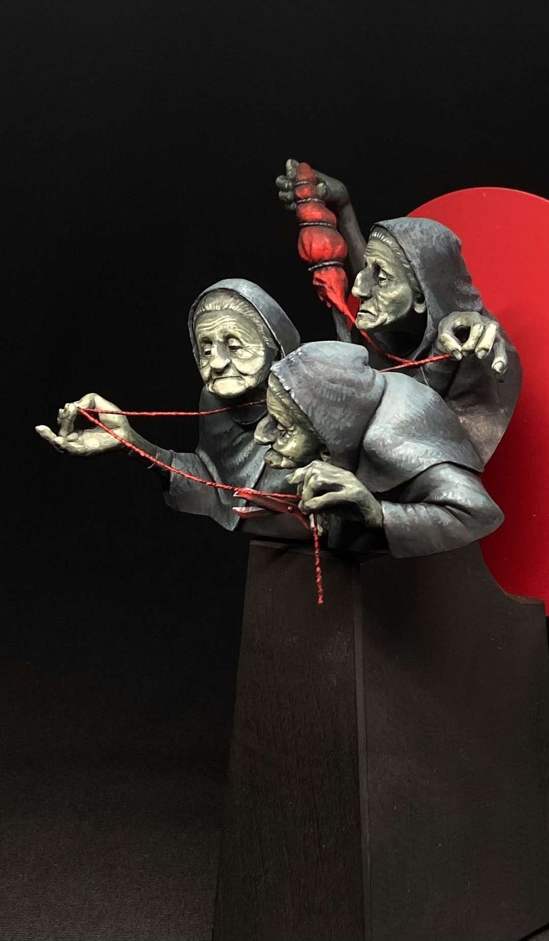
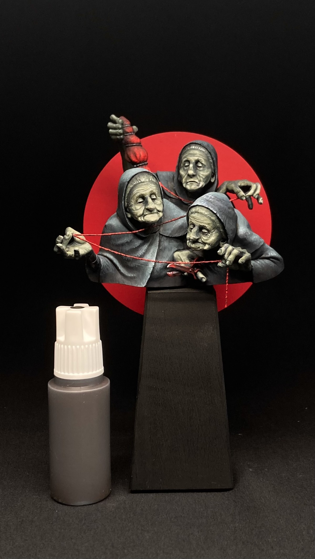
I painted it using only paynes gray, naphtol red, yellow ochre and white. Pretty much the Zorn pallette - but with a hint of blue from the paynes gray. The red was reserved for the backdrop and a few key items. The skin is a mix of white, paynes gray and ochre making it a desaturated green, that contrasts nicely with the red elements.
I love painting like this. Putting realism to a side and just going with what looks good and frames focus to the important parts of the scene.
Hope you like how it turned out

Melnikov Ivan "Nakatan"
Great idea, gold!Nate Boyles
So great! I live how much contrast you pring with the single color backdrops with the zorn-esc mini!Mikkel Frederiksen
I did my best to max out the contrast with this one. Green vs red + saturated vs desaturated.Nate Boyles
So great! I live how much contrast you pring with the single color backdrops with the zorn-esc mini!Steph.DPLUS
Vutz Or :)Sergey PopovichenkoPLUS
I like it!!Bastien Dupont "El_Gwakamol"PLUS
amazing job on this compo and choice of color !Štěpán Tichý
Great imagination and colour division. I like how the red background really centres and focuses the bust and the thread wonderfully stands out. Really great stuff.Mikkel Frederiksen
Thank you .-) Getting the thread to stand out was definately part of my vision for this project. I altso wanted to emphasize a sence og space in the sculpt, by having the red element go from the back og the scene to the front.MarcPLUS
Génial !Roman LappatPLUS
A really interesting and artistic interpretation of this great sculpt! I like the contrast that you created here! Keep on happy painting!Mikkel Frederiksen
Thank you Roman :-)Carlo
epic work!vincenzo gambinoPLUS
gold ...niceMariano del Olmo
Gold Mikkel! Great work.Fabrizio SchiragaPLUS
Gold