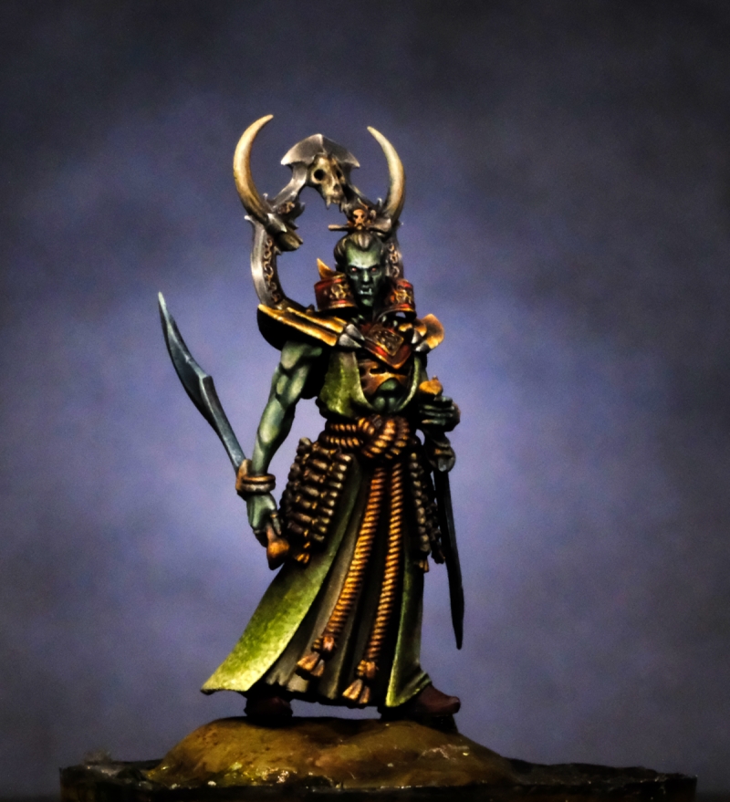
Brief was to use more aquatic tones (greens/blues) with complementary gold trimmings to be in keeping with a pirate theme. Various options for basing were discussed, but in the end we settled on a relatively simple composition placing the figure on a rock surrounded by shallow water and weeds. This nicely reflected the pose of the model itself, which is dramatic but still.
Brief was to use more aquatic tones (greens/blues) with complementary gold trimmings to be in keeping with a pirate theme. Various options for basing were discussed, but in the end we settled on a relatively simple composition placing the figure on a rock surrounded by shallow water and weeds. This nicely reflected the pose of the model itself, which is dramatic but still.


Roman LappatPLUS
He looks soooo evil! Well done! Keep on happy painting!