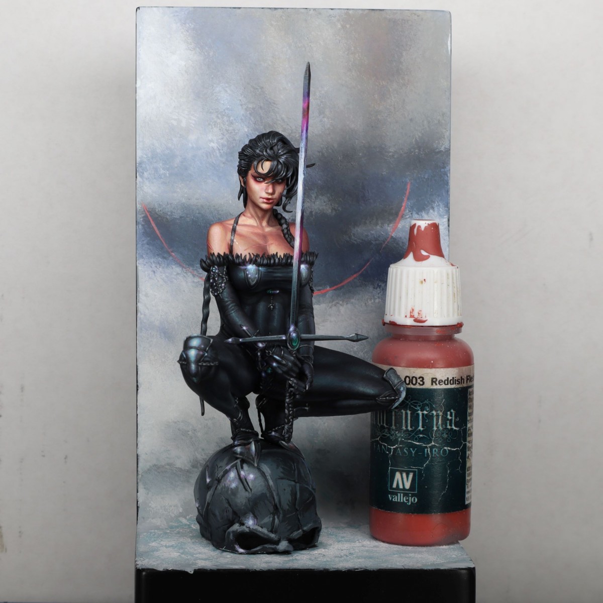
I have just finished this project based on the illustration by Kyuyong Eom.
I painted one last year, so I tried to build on what I had learned.
The facial anatomy was tricky because the sculpt did not reflect his style. So I had to look for several references to create a coherent and appealing face.
Overall this might be my favorite piece in a while.
I hope you like it as well :D


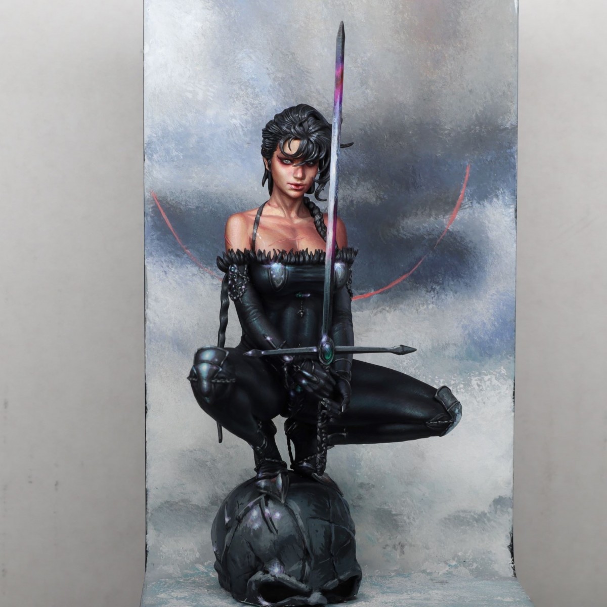
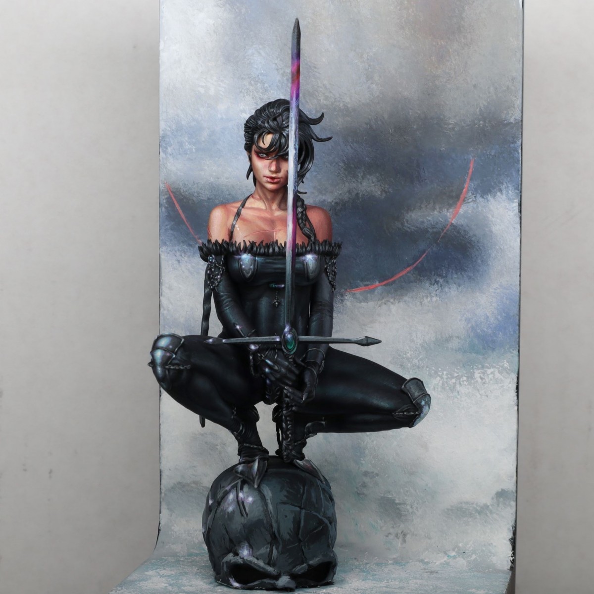
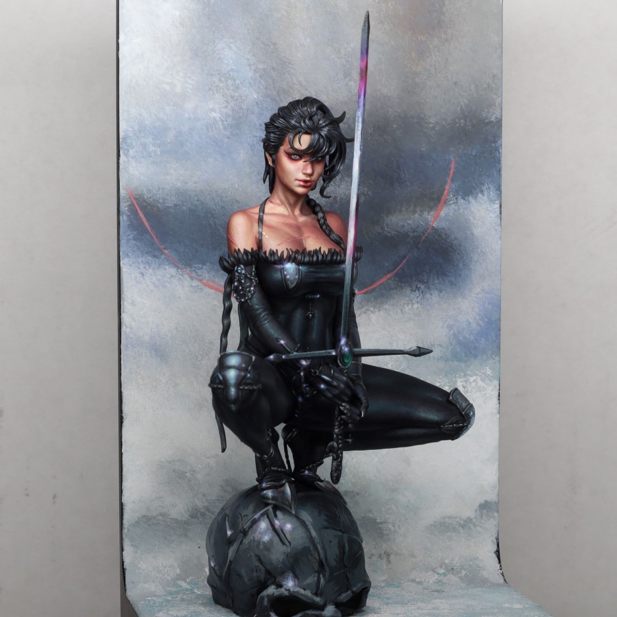
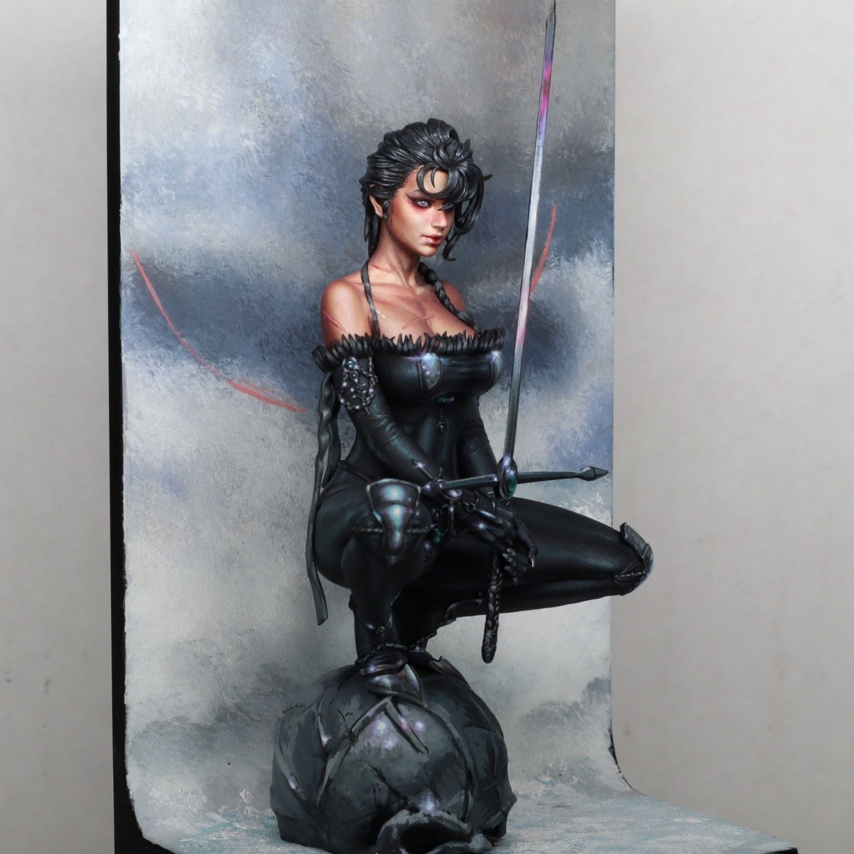
Tommy Gunn
Amazing.Štěpán Tichý
To me, the liberties with the original painting are done very well. Because the piece does not lose anything from them. I think that the face is painted really well and suits the face. The eyes make-up is done very subtly and nicely. Usually, I admire your skin tones and the skin here is great but what caught my eye, even more is the black clothes. They look very nice. I think that it is the case of the highlights and their placements. Also, the choice of the background being rough and not smooths helps the figure stand out more!eric wolfsPLUS
Woaw ! amazing . Great goldRoman LappatPLUS
I love when someone allows a painting to create rough and smooth contrast. Very well done from the original painting. It is more than obvious that you master to copy masters. It is amazing and a piece to study from. I am a big fan of your work. I can't wait when you put all your lessons you learn at the moment into your own concepts! Gold and Editor's choice from me!Luis UgartePLUS
Perfecta! Gold!Steph.DPLUS
Vote Or, tes peintures sont fantastiques Moses ................Magnus FagerbergPLUS
Damn, super good!!!Max RichieroPLUS
LovelyGus
Esplendida.Oroohtek
wow.....love~!!Davide De Angelis (CtrlAltCancMinis)
gold, exceptional artworks either the sculpt and the painting.. great stuff.. skin tone and anatomical details are sick :DBecky Short
i love the highlights on the black