I'm really happy to present to you my latest project:
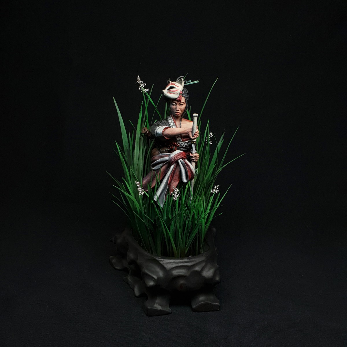
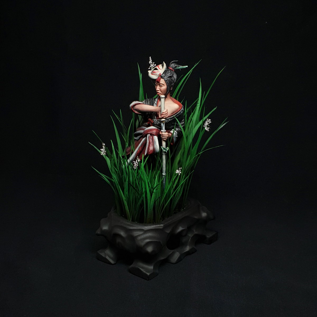
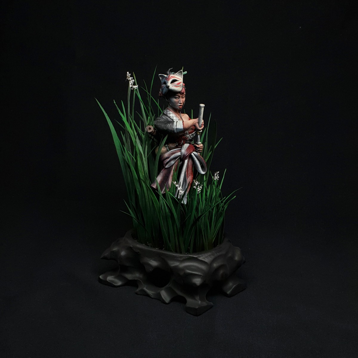
Three Graces: Kitsune
It was by far my most ambitious project yet. So much to learn from it and alot of fun^^'.
I hope you like it as much as I do.
C&C&Q are greatly appreciated!
Model by legionminiatures
Greetings
Norman


Melnikov Ivan "Nakatan"
goldNorman Mrx
Thank you for the gold.vincenzo gambinoPLUS
goldNorman Mrx
And finally here.. Thank you :DJakob VPLUS
First of all, strong paintjob. Focused and powerful. The scene works well and I love the tall grass. For me I think it would have been strong without the untraditional plinth, as with this it breaks the illusion of a larger scene. Regardless; beautiful.Norman Mrx
Thank you alot for your comment. I really appreciate it that you took your time to write this. In retrospect I have too agree with you about the plinth...in my mind it also had a wider feeling to it...oh well ^^' learning something new with every step on the way :DJakob VPLUS
You are welcome. For the record, I gave you a gold. There is never one answer with stuff like this, and this definitely comes down to opinion. Doing stuff like this sometimes works perfectly.Norman Mrx
Thank you for that, too. ^^ I've got to check out your projects.Jakob VPLUS
Oh please do - and let them comments flow if you feel like it. :)eric wolfsPLUS
I like a lot the idea, and the painting is top ! GoldNorman Mrx
Im glad you like it! Thank you for the vote.Rhiana, "Cyradis"
I really like the concept of her in the grasses, but since my eyes were expecting a full figure instead of a bust, I kept visually looking for legs! The composition I still think is lovely, and I like that you patterned the fabrics. To me the highlighting feels slightly incomplete, but there is still a lot of expressiveness to the face. Great job and I'll be glad to see more of your work :)Norman Mrx
Hi Rhiana, thank you for you nice comment and great insight. Do you think more high grass infront of the lower body would have changed the expectation of legs( won't be able to add more now but I'm really interested in your opinion)? Concerning the highlights and pattern, I could have probably put another 30h auf work into it, buuuuut to be honest, i got impatient and wanted to move on to the next piece xD.Rhiana, "Cyradis"
Hey Norman! I don't know if more grass would do it. If anything, perhaps less. Bringing the bust forward would make it clear that it is a bust, and the grass would be more of a background scene. Then it would be obvious what type of figure it is. I think the highlighting is more in regards to the skin than the cloth, since the skin is "up top" and would catch more light. I 100% sympathize with being satisfied and going "its done!" You picked a good spot for that, because the figure is indeed quite beautiful. Sometimes it is best to call it good and spend those 30hrs on a new project instead of nitpicking the current one. My half dead maiden bust was kinda like that - she just needed to be done.Norman Mrx
Thank you for further elaborating your point... it actually was my intention to make the bust look like..not a full model..but a "cowboy shot" (cut at upper thighs).. guess my planning was a little off, since she is now cut at the calves...oh well..happy little mistake. Thanks again for your insight, you made me analyse the piece with a more critical eye and learn a thing or two.Eamon Connerty
Love it! Gold!Norman Mrx
Thank you for the vote! ^^davidg100
I vote Gold for the idea of the scene, the effort on the freehand and the texture of the fabrics. May be you could have tried to make the plinth have an older/antic look… Anyway, it’s a nice one !Sioux Native
Gold!