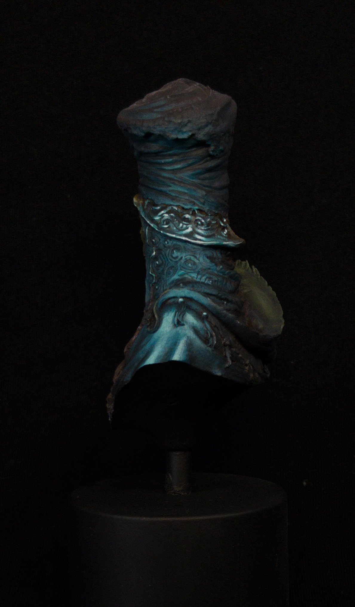
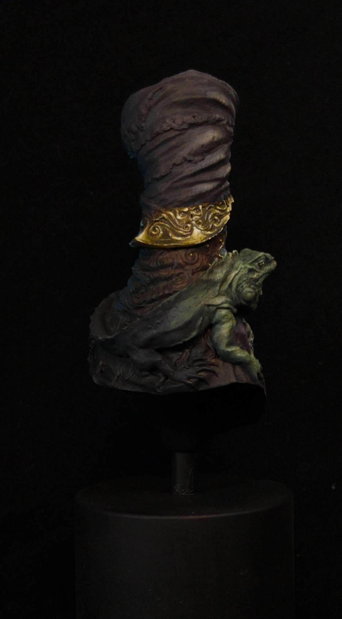
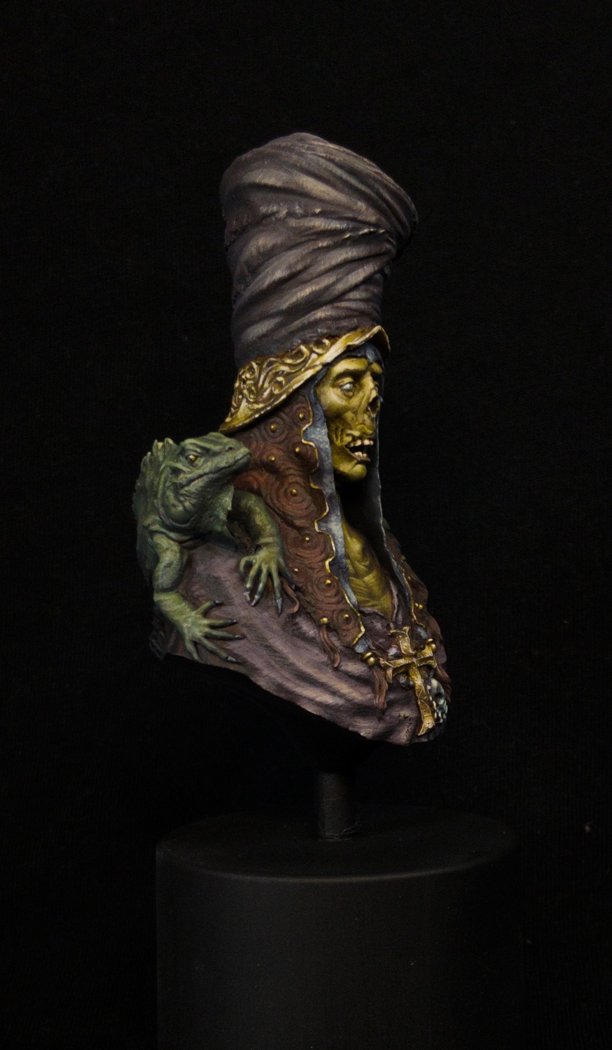
I wanted to specifically focus on lighting and try out a side-glow effect. The inspiration that really drew me into painting the piece was specifically a vision of a harsh camera left light source with strong shadows, then a camera right side-from-below glow. Glows aren't something I've done before on busts, and I've not done any osl in general for a long time, so I was treating this as purely a learning piece, to get to grips with how osl on busts work before trying it on a proper "try-hard" project I've got planned.
Pretty happy with how it turned out overall, even if the skintone is a lot more saturated compared to the fabrics than I was originally planning for it to be, which looks a little odd in my opinion.


Roman LappatPLUS
It is a beautiful version of this bust. The fabrics, nmm and lizard skin is amazing. I think the saturated skin of the guy himself is working well too, just plays a little game of focus distraction with the nmm colors. The cold rim light to the side is well integrated. Really well done. I voted silver. Many things are really well done on this bust. I think the only small downside is the pure black dark shadow part in the back. I could imagine definition of elements there too with a small highlight as compared how much light hits the nmm in the back I miss logical treatment of the rest back there ... but then your rim light might not work anymore. Well, this can be solved and is I think a good homework for the next time you paint something like it. No offense, just honest feedback. Really like it!Melnikov Ivan "Nakatan"
You've done great on him. A lot of work and quite pleasing result. that dark magic atmosphere is just phenomenal. You deserve no less than gold!DavidColwellPLUS
Hello, I also votes silver for this piece. It is excellent and I think it is really well executed. It was very close to a gold for me, I’m the kind of person that likes most things and I have difficulty not just thinking everything is awesome. However I am trying to be as objective as I can now that I’ve been asked to be an editor on the site. I have different reasons why I think this only just doesn’t quite reach into gold. Personally I don’t mind so much the back side not being coloured like Roman says but while it’s very close to gold for me I feel like the overall focus is just a little bit off. When I look at the main front on picture I find a balance of focus issue with the bright NMM on his front and his face. I feel like those to areas are clashing for focus and it makes my eyes want to jump back and forth uncomfortably.DavidColwellPLUS
I’m sorry I had to break my comment into two parts due to character limit in comments. I am aware that unfortunately that this becomes an intrinsic issue with painting NMM because we need to make really bright highlights and big contrast on metals to make them read as metals. I don’t think there is an easy solution but saturation and temperature changes to help with focus is a potential way to alleviate this issue. It could also help to bring some more value into the elements around his face and especially onto the lizard which I feel gets a bit lost and could be used or help bring the focus to the face. Honestly you should be proud of this piece, I hope you won’t take offence at receiving the silver as silver is still a very good result.Alex ✍
Beautiful work Alex!Eamon Connerty
Very nice work! I like it better than my version, gold from me!Archigrog
Add a comment