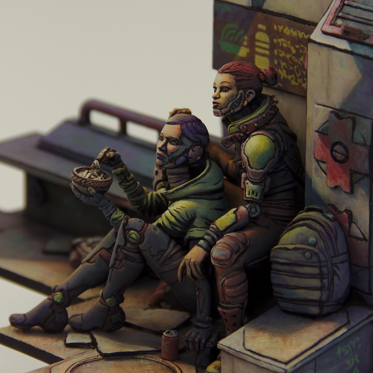
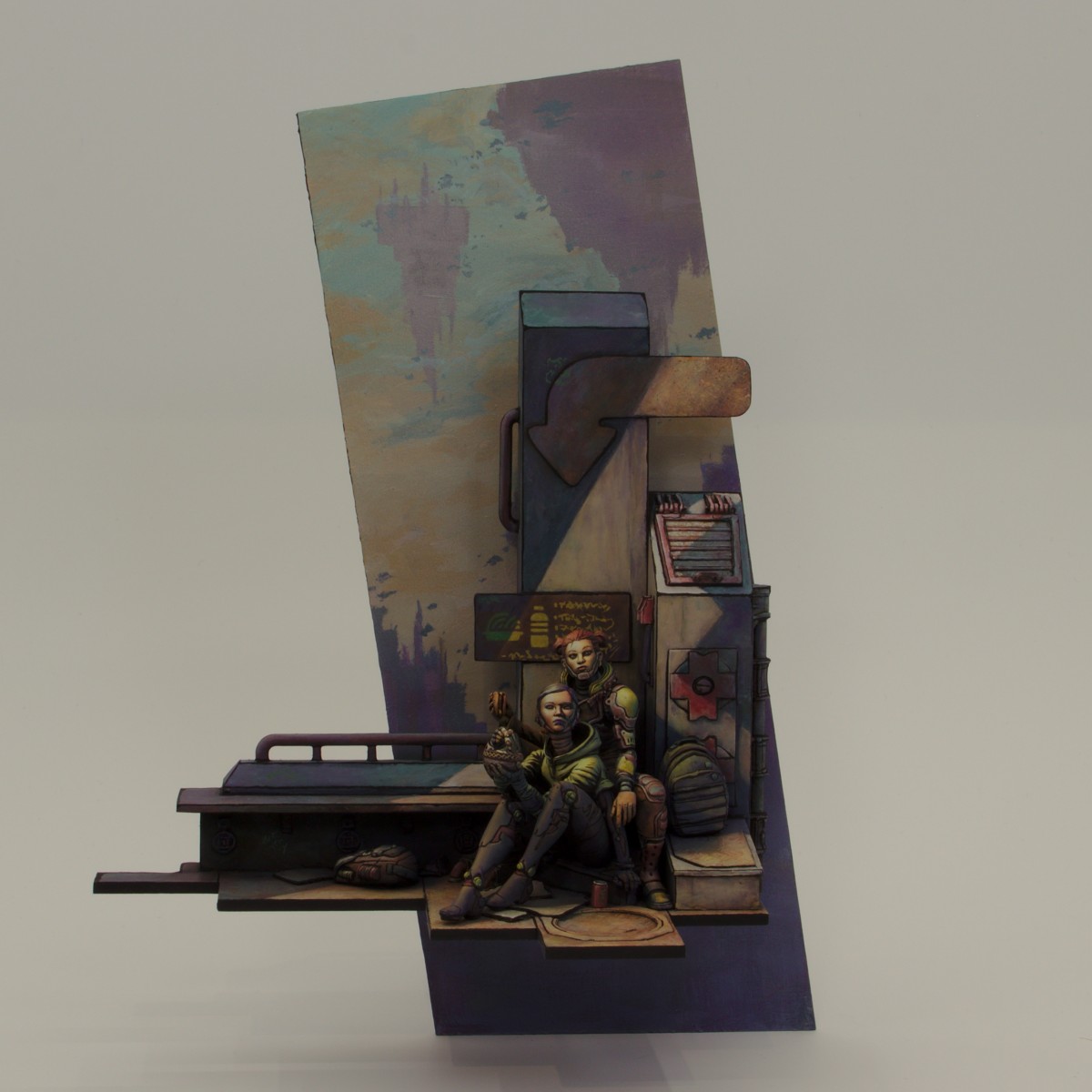
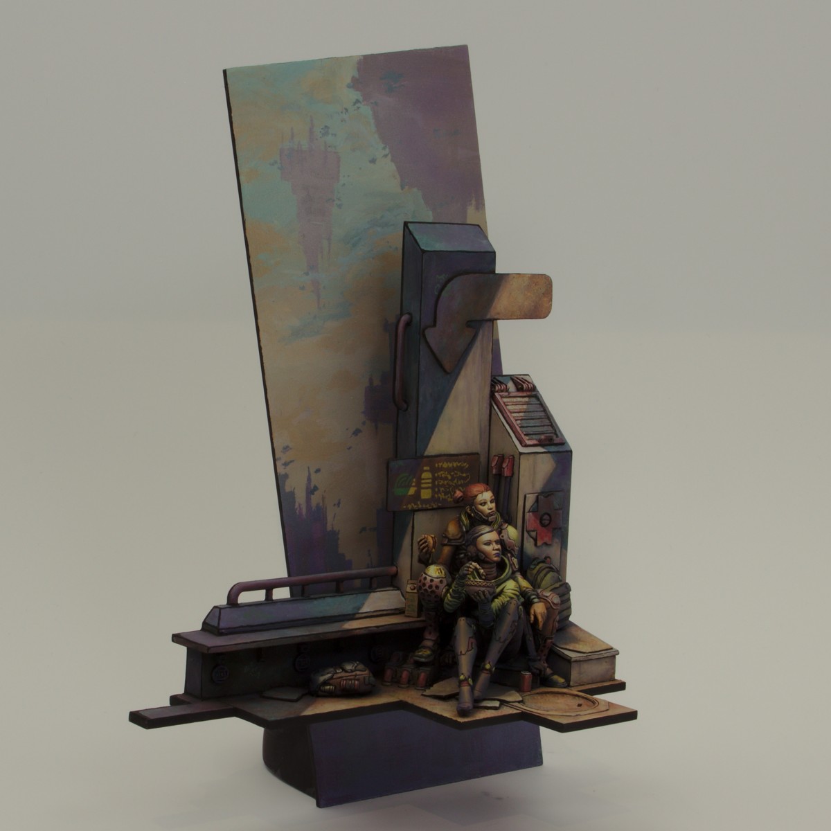
Tue had the idea a long time ago to change the mood of the girl at the back by switching out the gun for a burger – when the noodle girl was released, I knew Tue’s idea would work great with it as a diorama of the two. Tue gifted me the burger idea and so it happened :)
Tue had the idea a long time ago to change the mood of the girl at the back by switching out the gun for a burger – when the noodle girl was released, I knew Tue’s idea would work great with it as a diorama of the two. Tue gifted me the burger idea and so it happened :)


Rhett “Saint Toad” Jenkins
There is nothing I don’t like about this. Incredible concept and execution.Wade
Thanks again man :DMelnikov Ivan "Nakatan"
and here are my gold and my applausesWade
Thank you :)Marius "Der Stone "Stein
It's amazing!Marius "Der Stone "Stein
Great story. Really nice conversion. And an amazing paint job. Is she eating a "deathburger" ;). There is so much in these diorama I like. Thanks for sharing it!Wade
Thanks! Glad you like it so much :D Hehe, no deathburger ;)Jakob VPLUS
So beautiful!Wade
Cheers mate :DTobias_K_Aasvang
Truely fantastic!Wade
Thanks Tobias ^^iil1987
Amazing! I wanna dive into the pics and analyse this master piece. Congrats!Wade
Thank you :D I geek'd out on the composition design on this project, so I am happy you enjoy and analyze a bit :DRhiana, "Cyradis"
This is beautiful and very stylized work. The dark-lining is pretty intense, but in a way that makes the scene feel a bit out of a sci-fi video game. My only complaint is that it seems the photos aren't quite bright enough to show off your good work :)Wade
Thank you :) It is definitely inspired by the video game Borderlands - I was quite a fan many years ago. Your not the only one that doesn't like the photos ;) I seem to struggle keeping the depth and breadth of colours, contrast and brightness at the same time. It's a general problem and people often get surprised now much more impact my projects have when you see them in hand.David Batista
Gold!Wade
Thank you!Mateusz Banaszkiewicz
Oh boy, these pics don't do this piece justice... Wonderful idea, style, feeling. Tilted backdrop is very cool. Having seen it in person on Kontrast, I must say it's one of my favourites from all works present there. This is art. This is gold.Wade
Much appreciated!Natalia Oracz
Gold from me, both here and during Kontrast 2021 :D Love the composition - a fun play on Andromeda miniature (but let's be honest, a good burger can improve basically everything :p) and the sunshine shining between the building beautifully highlights the main points on the diorama. The pictures don't show how great the colors are :)Wade
:D Thank you Natalia! Burger ftw for sure ;) I have been hammered by almost 10 people now for crappy photos XD I am trying to figure out RAW processing and colour calibration to see if I can photograph my projects better... sighMarco Ruano Miniature Painter
Wow!! Magnificent interpretation is a great work, Bravo!!! Gold.Wade
:D !pstockley
You pulled off the comic style very well. Great job.Wade
Thank you :DYaroslav BozhdynskyPLUS
Saw it up close, epic!Wade
Awesome!Magnus FagerbergPLUS
Excellent work buddy!Wade
Cheers Magnus :)Marc MussatPLUS
great work ! they work really well together !Wade
Thank you Marc :)Martin Lavat
Powerful! Strong Gold!Wade
Thanks Martin :Ddavidg100
The composition and the light are magical ! Great work GoldWade
:D ! glad you like it!