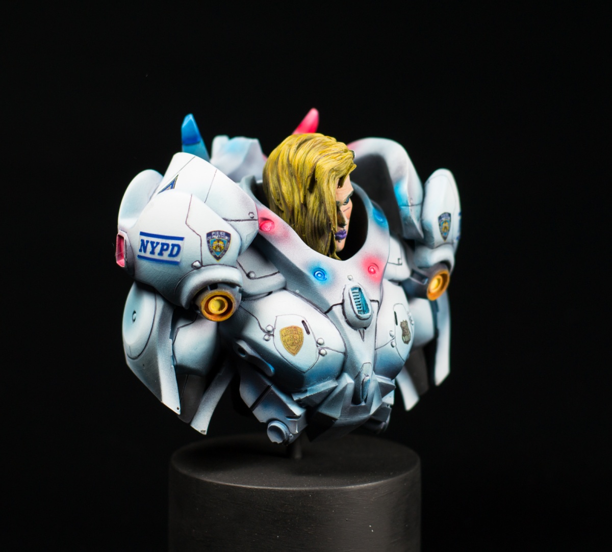
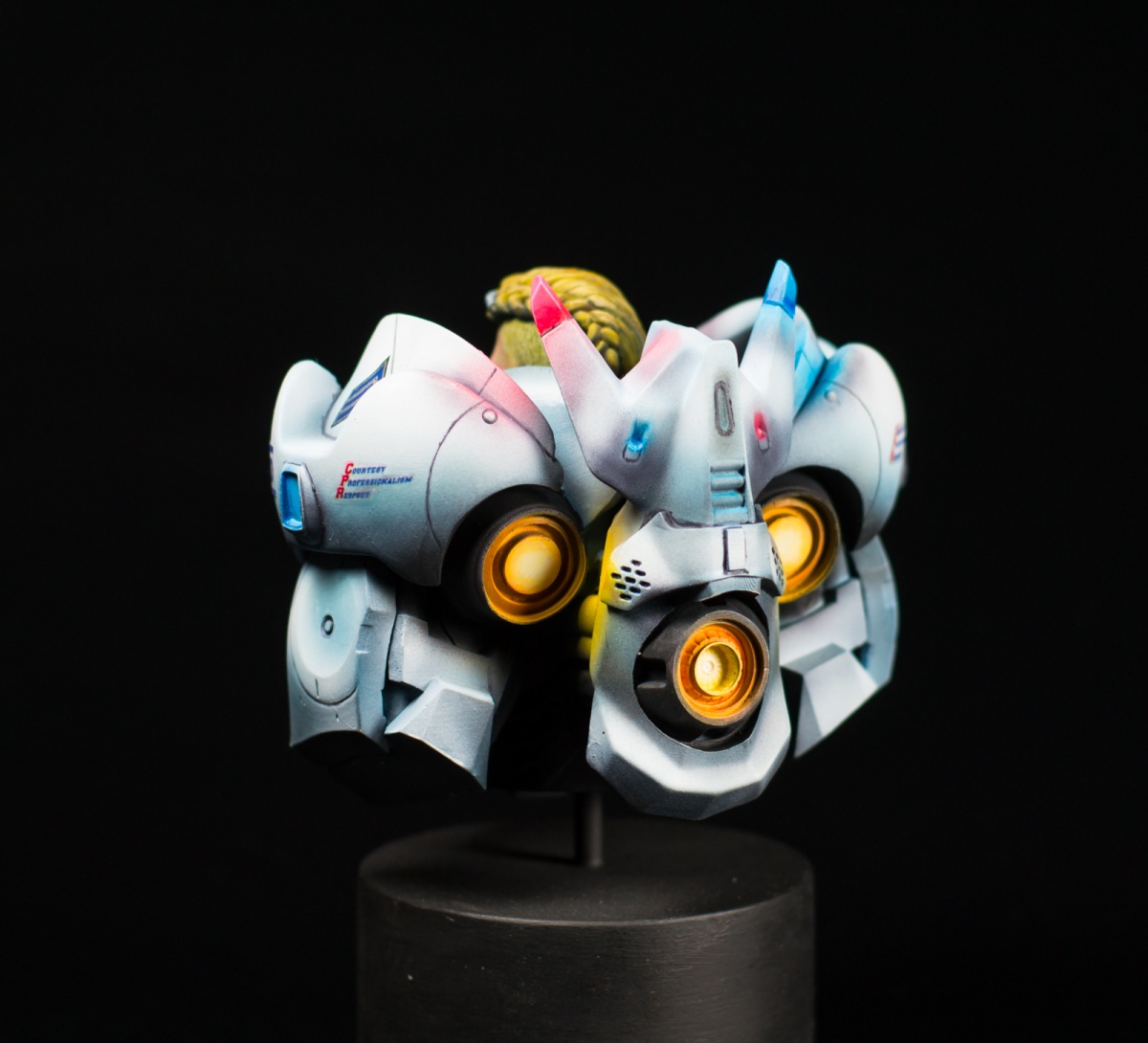
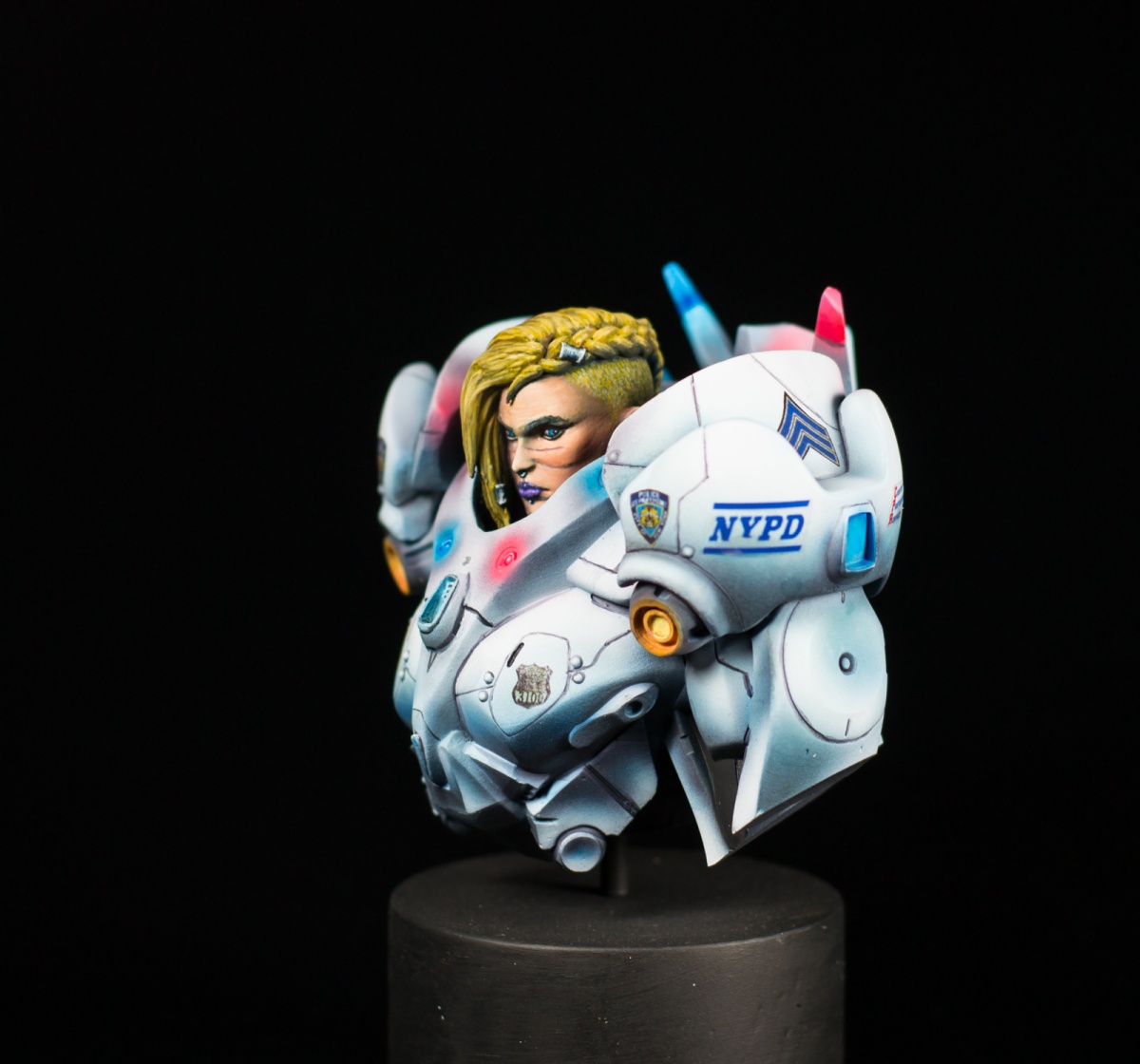
This is Siggi from MrLeesMinis I've done in 2020.
It's 2076. The world is cyberpunk. In NYC every cop has a combat armor as their own police car equivalent.
Sergeant Siggi is on the streets since years and knows very well where the hot spots of gang activities are.
I was struggling at the beginning with this bust. It's big and has large surfaces. First I wanted to do some desert camo but really messed it up (hihi). After starting from scratch again, the idea of the cyberpunk-police girl came up.
Mainly I tried to do the armor as a study in white. The whole bust was painted in light blue with black for shadows and white for highlights. In total it came out pretty well I think ;)
Even I was struggling at the beginning with the big areas, I really recommend to grab one to paint, it's really fun and not that hard as soon as your vision is clean.
Hope you enjoy ;)
Greetings
Andy


Eamon Connerty
Very nice work! Love the NYPD theme!Andreas P - HanzPetersen
Thank you very much :DKyle Maitland
Clean work. An area to watch, if I may, you have lights on her, but the areas surrounding lights are darker than adjacent areas. That makes it very hard to read your work as lights.Andreas P - HanzPetersen
Hey Kyle! Thanks for your comment and the input! I’ll try to explain ;) The dark areas are on purpose surrounding the lights to increase the effect. It’s not easy on a white area to get a glow-like effect. The idea was the natural effect when looking into a light, the small area around is darker. Hope this makes sense.Lukas chopachopa Bende
rly cool work and i think shadows and lights are fine coz more lights she will be shining too much but its just my opinionAndreas P - HanzPetersen
Thanks Lukas, this is what I was thinking aboutRicardo Pisa
You can sell those light effects!Andreas P - HanzPetersen
Thanks Ricardo! I'm glad that they work ;)Melnikov Ivan "Nakatan"
wow that's gold!Andreas P - HanzPetersen
Thank you so much :Djparkdr
goldAndreas P - HanzPetersen
Thank you so much :D