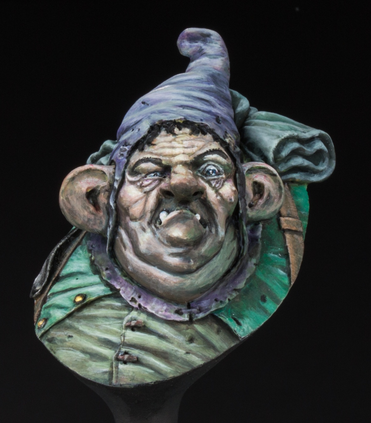
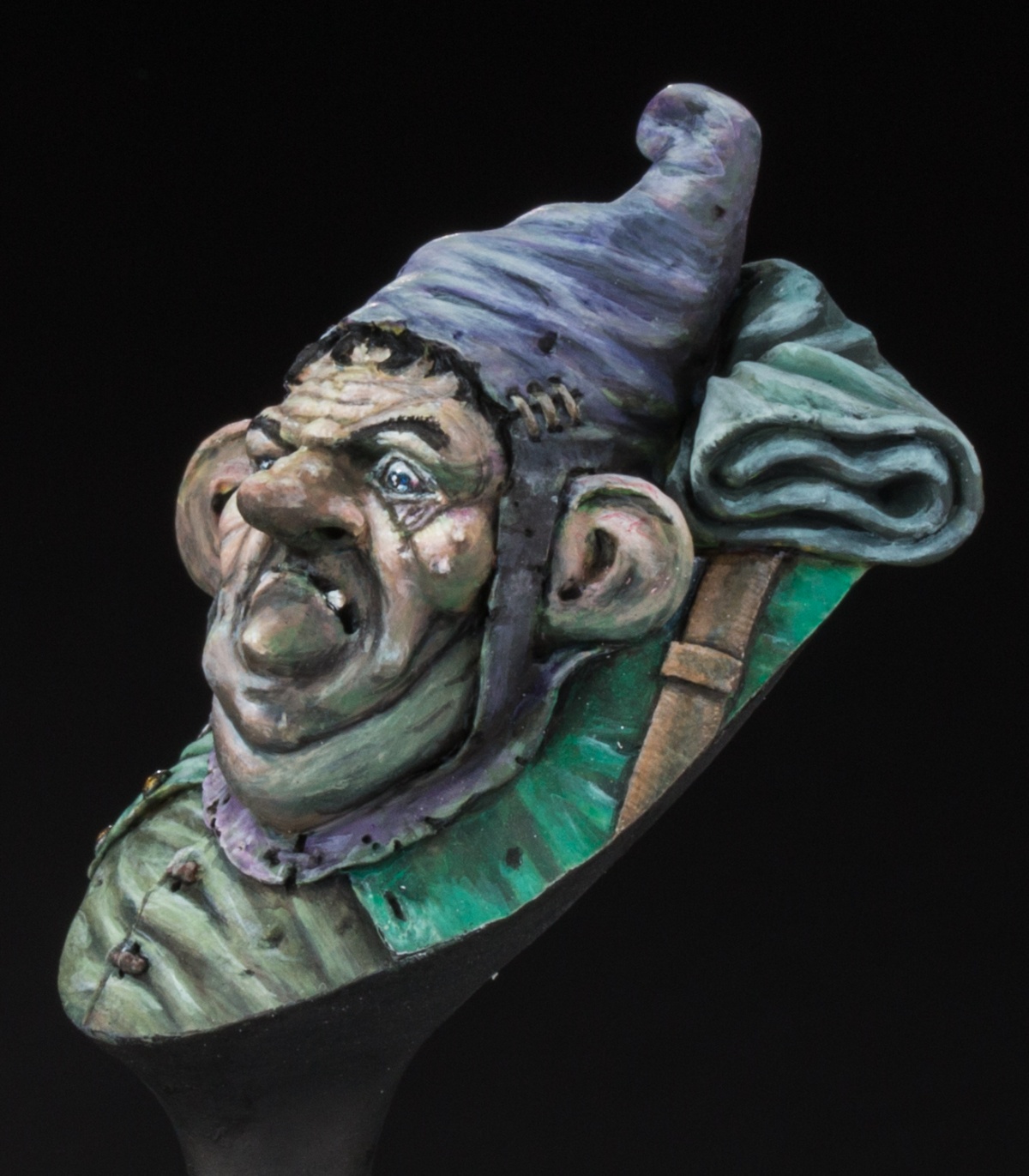
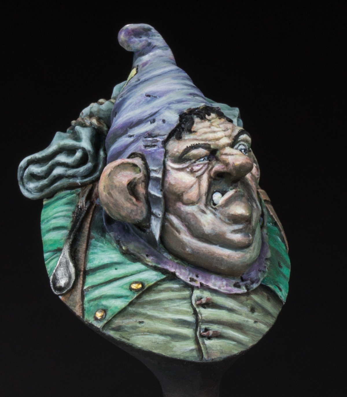
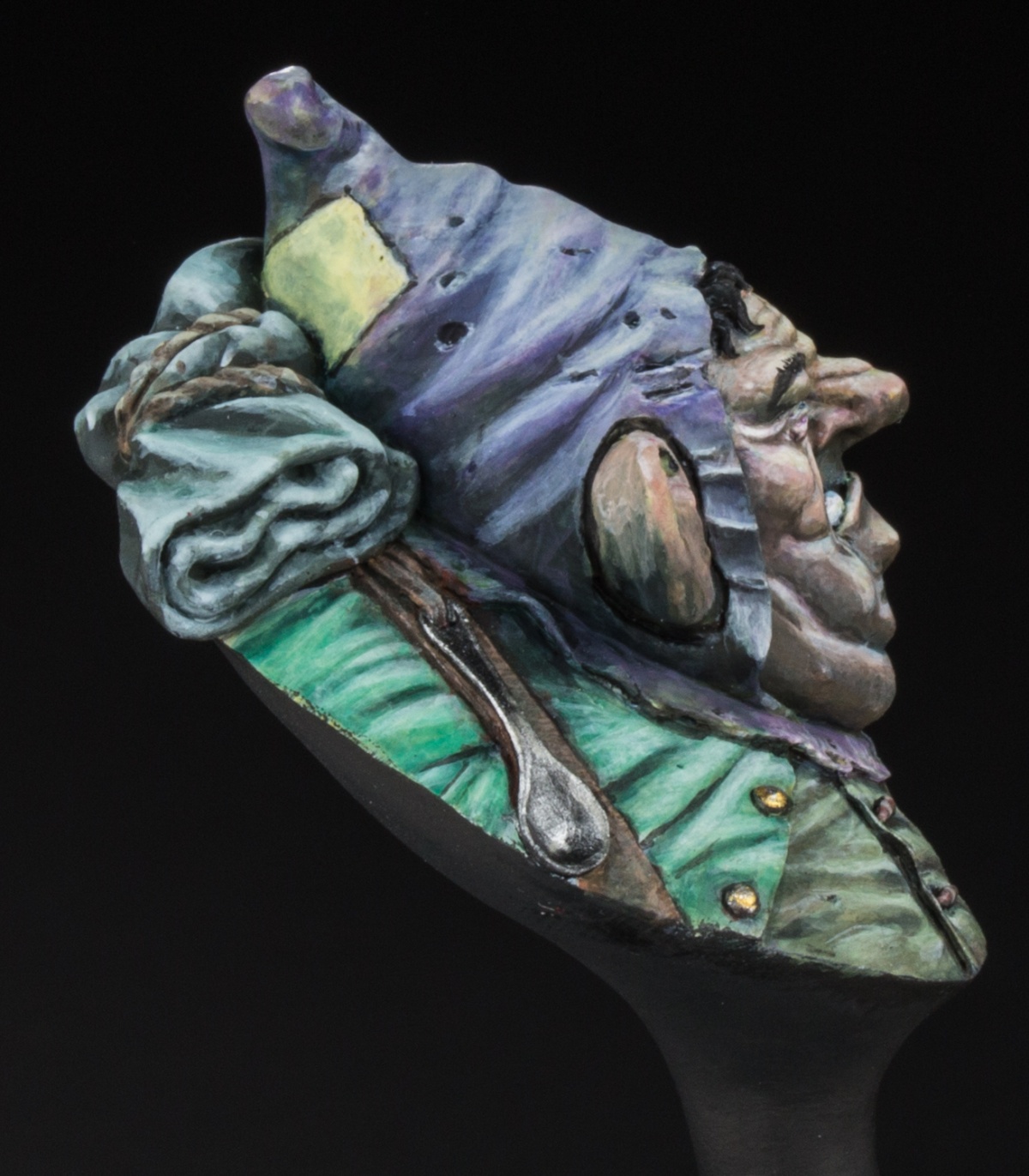
I painted this version of Raffaele Piccas bust about one year after I did the sad version displayed earlier. First of all because after intensely disliking the ugly face to begin with, I realized its actually a pretty fun to paint bust: It has lots and lots of interesting and fun volumes and details - it really shows that Raffa knows a lot about painting as well as sculpting. Its just fun.
The second reason was that I never managed to make the sad version *click* just by itself. During a materials workshop by Roman Lappat in the MV-Studio, I had the chance to see that version in the showcase side by side with two versions painted by Raffa - and all of a sudden the sadness in my copy became readable. I realized that sometimes you can use not only the contrast within a piece but also the contrast between pieces to show something - for example emotions.
And so I painted up this second version - Angry and a bit haughty. I like to think that if you look at them side by side, the different emotions become apparent. But judge by yourself.
Even though I consider this project finished now, criticism and feedback is highly appreciated and will find recognition in my next attempts.


Roman LappatPLUS
Great, you accidently deleted it, I accidently clicked wrong now while deciding for a medal. All these accidents ... sorry. Your best piece to date!Hansrainer Peitz
Thank you - it was a lot of fun to paint.David KuehnPLUS
Cool piece, HR. I agree with Roman - for me also it's your best piece thus far. I love the color scheme and the emotions this one transports and it's really well painted from a technical standpoint as well. Thanks for sharing!Hansrainer Peitz
Thanks a lot for the kind words :)