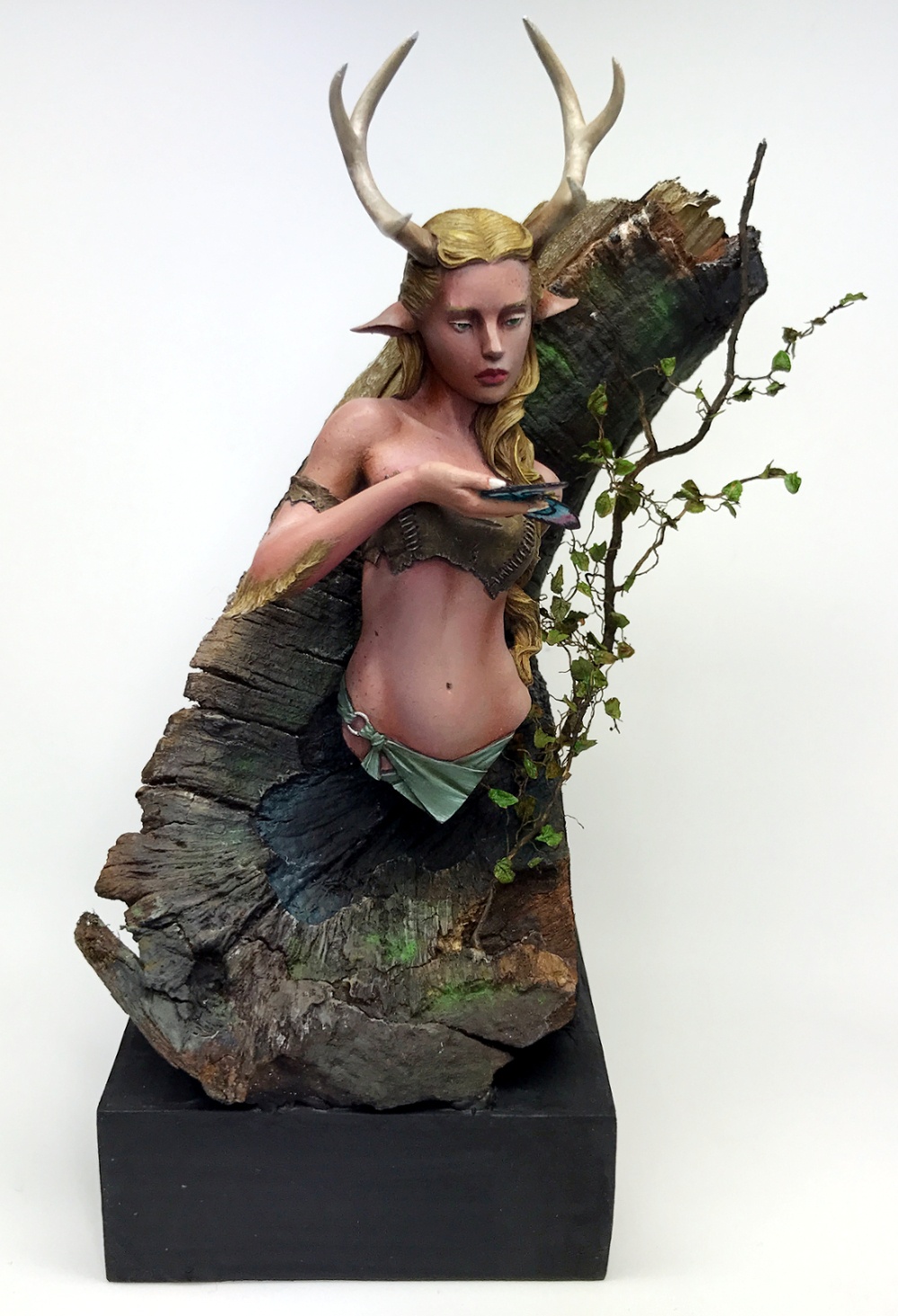
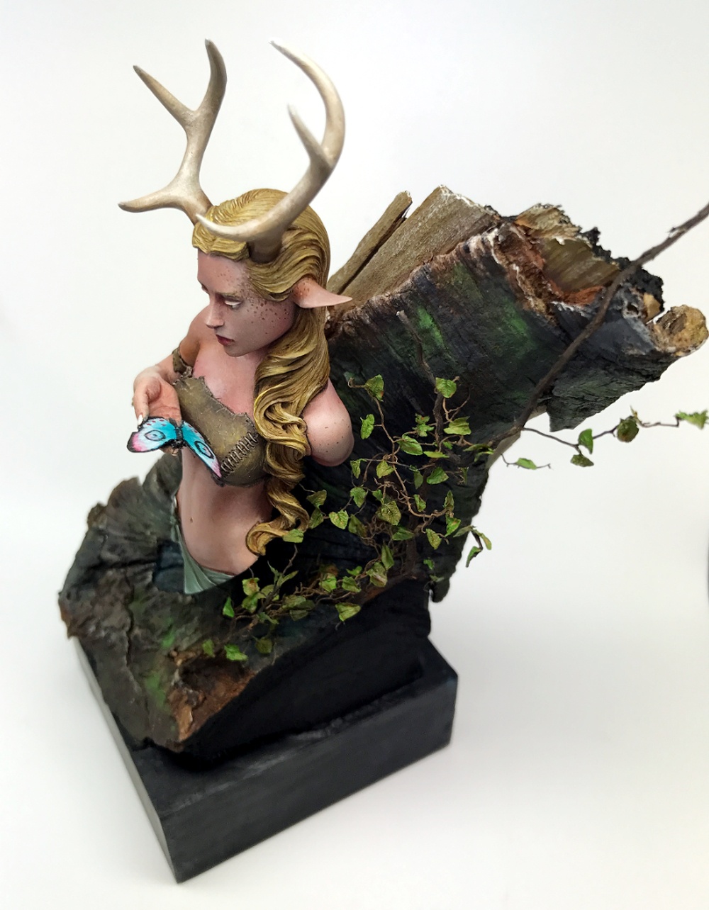
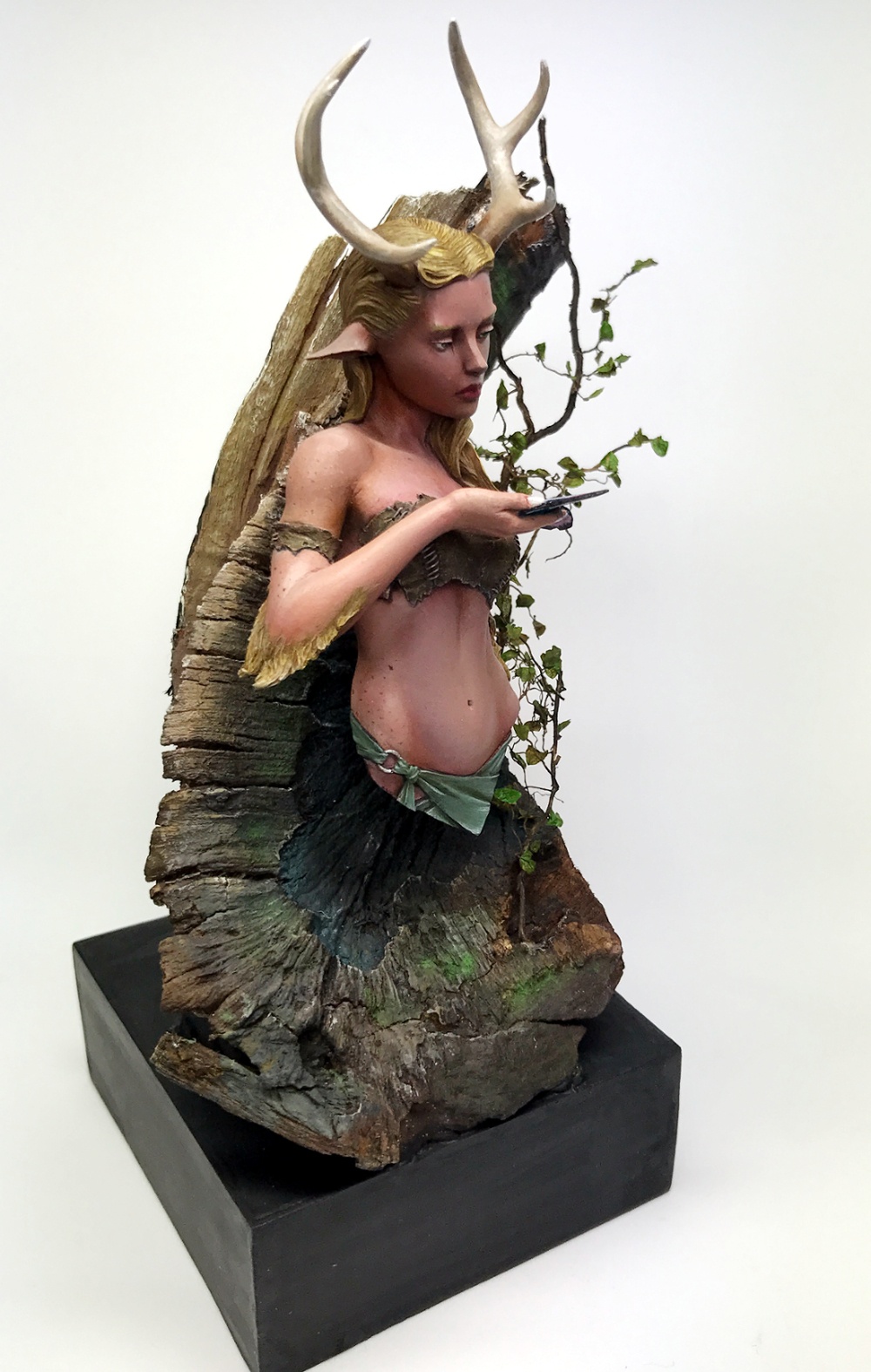
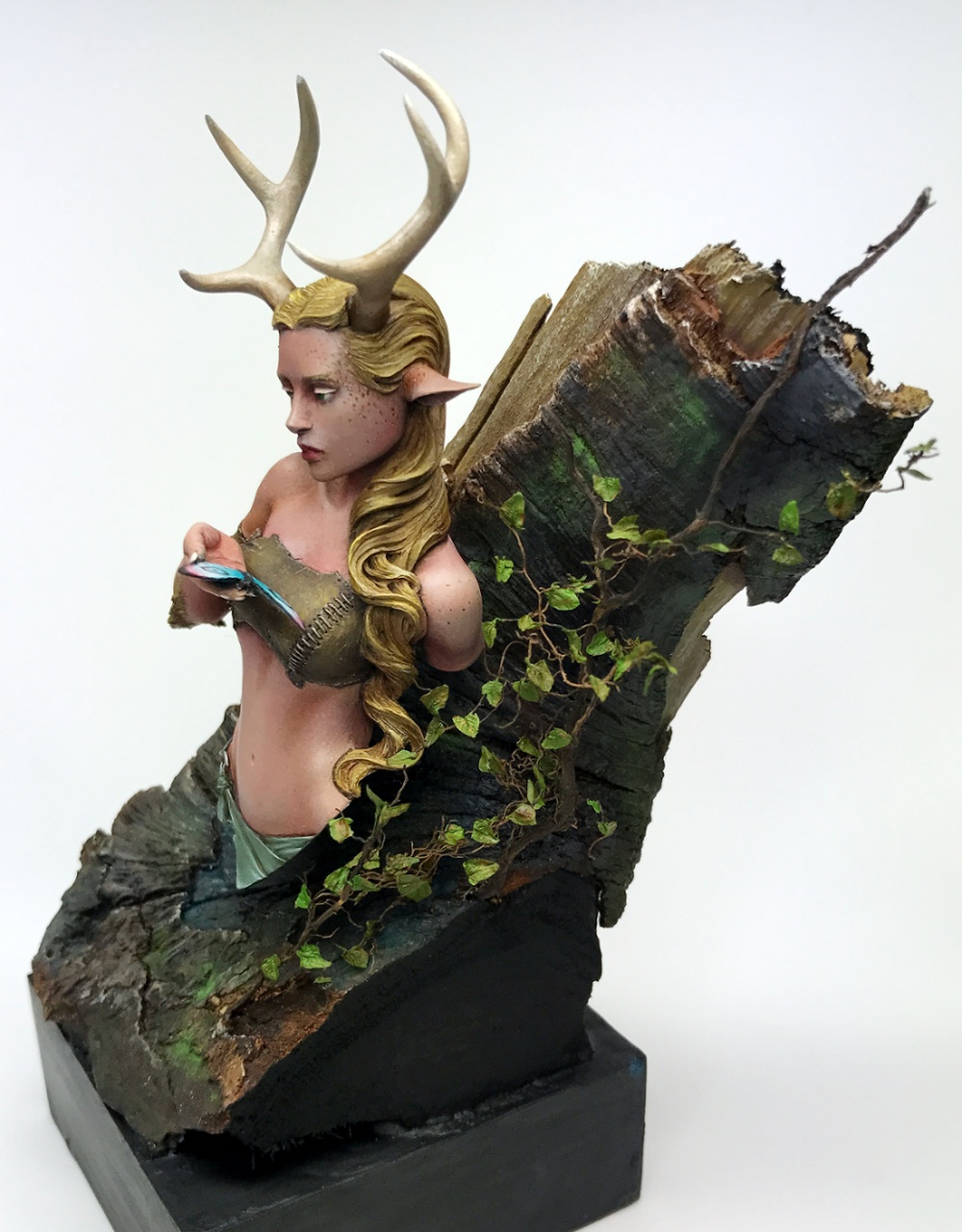
Painted using mostly acrylics but also some oil on the skintone for shadows.
It have been quite some time since my last project got uploaded so it was about time to challange myself and actually show something here again (hard with all that tallented folks over here).
I imagine her to be both sad and curious at the same time looking at that butterfly and maybe communicate with it.
Anyway, hope you like her andI´m always greatful for some helpfull tips along the way.


Paolo-Di-Poce
nice work, smart idea and nice quality. Probably a different tones on hair would have worked better ( red hair + freckles) for a better contrast BUT it is of course nice and deserves a good medal. VotedDenniz Hedin SaloPLUS
Thank you! Yeah, it might have looked better with a more reddish hair. Might do something about it later on. Thanks for the comment!Oliver "HonourGuard" SpäthPLUS
Lovely composition. It's not easy to get a good connection to a base with a bust. But this works pretty well. The plants on her left with the leaf looks great. Painting is nice too and this work is by far your best in my opinion. Nice development, keep it up! ;)Denniz Hedin SaloPLUS
Thank you! Yes, it's hard to connect a bust to a base without looking strange. This was a bit of a test and it worked out pretty well. And thank's for the encouragement!Winterland
Great workDenniz Hedin SaloPLUS
Thank's!Melnikov Ivan "Nakatan"
Gold!