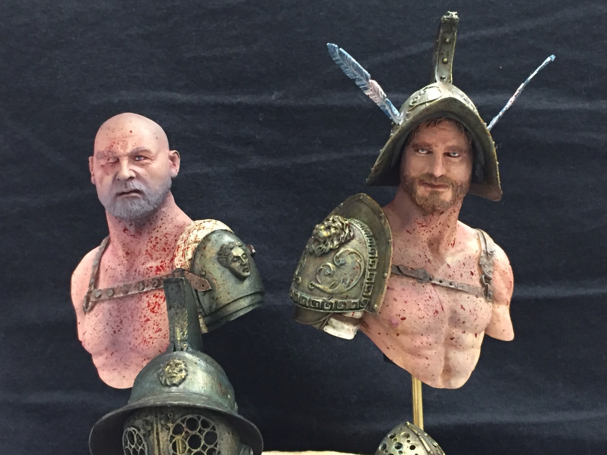
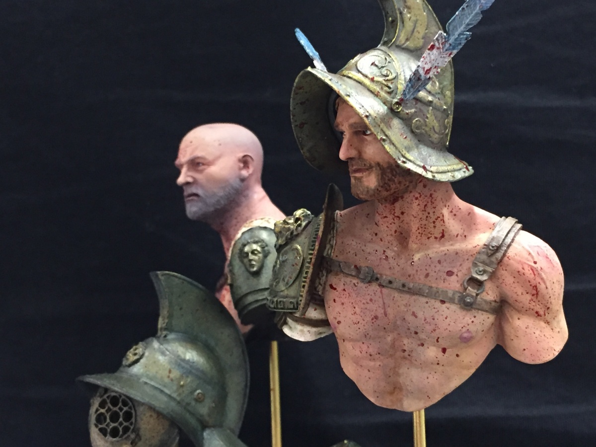
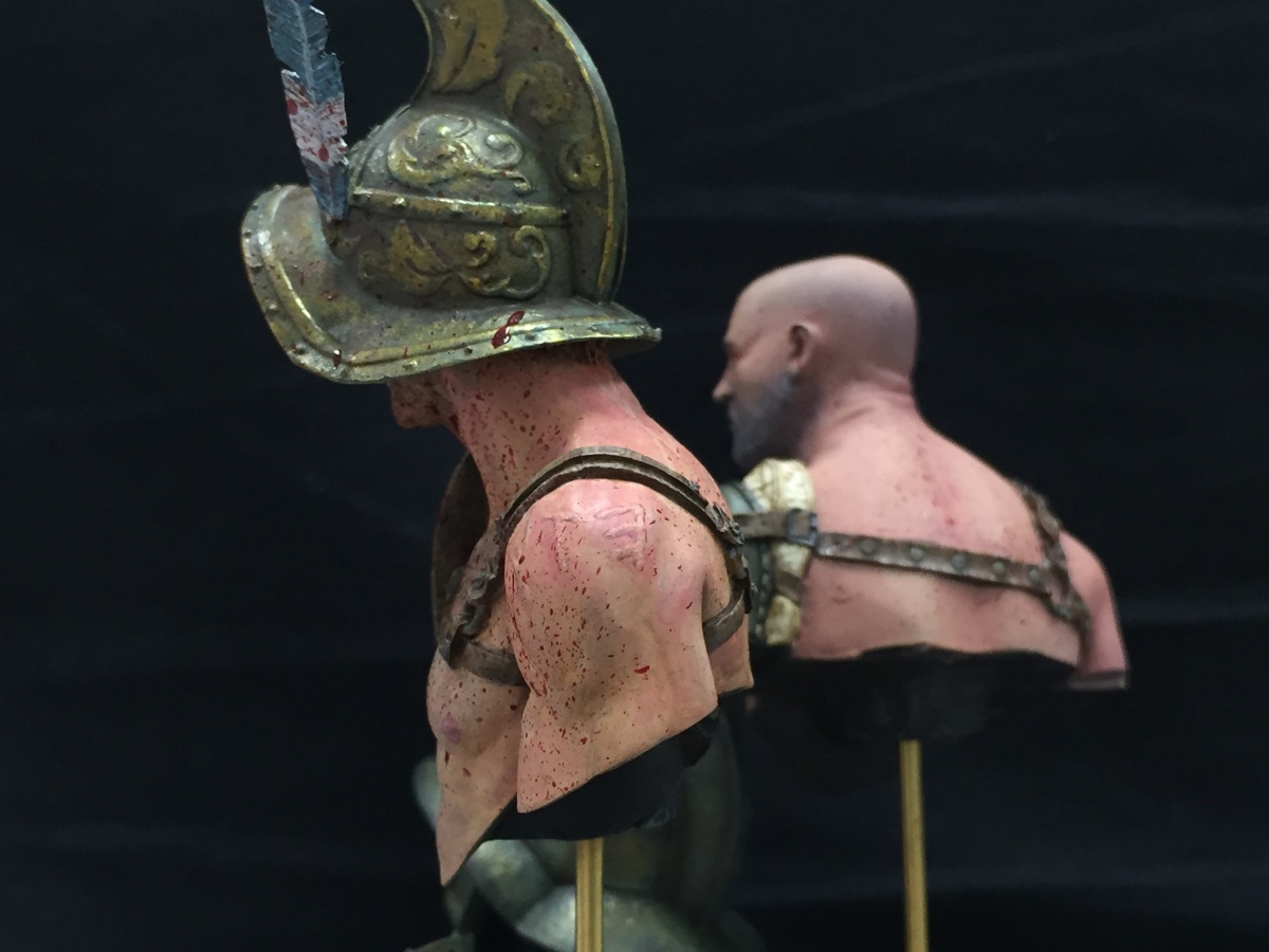
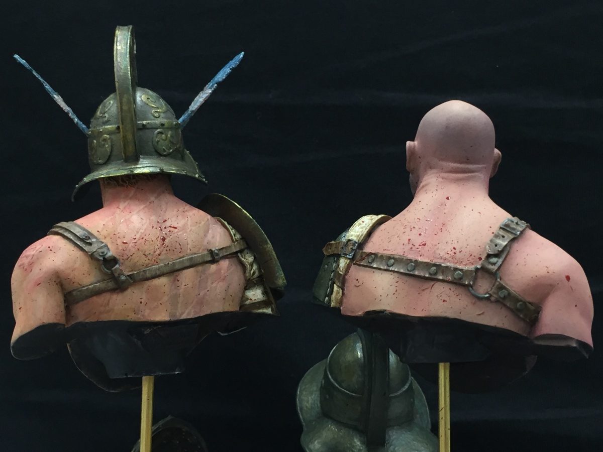
The baying of the mob was deafening, a physical wall of sound emitted by a mindless entity all in the name of entertainment. The final two stepped over their kills and paced with purpose to stand before the Directors box. The champion of the Cupua Ludus, Latro and free citizen of Rome Antonius Fallarii Meteor stood to the left. The face of the grizzled legion veteran now earning a living as a free gladiator was as ever calm, devoid of emotion. To the right stood the rising star of the Capitime Ludus, the Thracian Voltrax, a slave taken in battle and forced into the arena, he had learned quickly and killed with ruthless efficiency.
Both had been fighting for just under an hour, there had been twenty competitors when the bouts had started, now there was two. The prize on offer, for one an estate on the hills of Campania to retire on, and for the other the Rudius and the freedom that came with it.
Voltrax eyed the Director of the games with cold hostility, he hated him and everything he stood for, Meteor was disinterested and keen to be about his business.
The crowd fell silent and the Gladiators raised their weapons.
“We who are about to die salute you!”
The roaring of the crowed returned as the two replaced their helms and faced off ready to continue.
Who will win? I leave that to your imagination!


Jay Martin (Redrum)
I particularly like the armour but your next step is to add more definition to the anatomy and introduce more colours into the skin so it loses the "flat" look. A level up for sure!Paul Bullock
thanks Jay, I need to learn to take better photos as well, there is much more contrast in real life, but point taken on board. The TMM bronze has been fascinating to study before painting, deconstructing the colours of the elements in the metal prior to painting helped loadsTimPLUS
Having seen this in person I can say this is some of the best TMM I've seen.Paul Bullock
thanks mateTony Corradine
Excellent work Paul. Can't vote as haven't uploaded anything but love the workNorman ( Normski )
Hey up Paul.. as you know i love the metals on these.. but the scarring on the back is a great touch.. Only thing for me is a bit more deffinition on tbe skin tones on the front but still super work palPaul Bullock
Thanks buddy, taken on boardKen "Macca Chung" Lim
Love the scars. Well done mate!Paul Bullock
thanks bro, I need to learn to take better pictures that dont was out my transitions thoughRoman LappatPLUS
Hi Paul, really enjoy these two. Sadly it is hard to judge them properly as - like you say - your photos are not the best. And in the of the day we are judging photos of miniatures here, but I completly agree with Redrum. More definition and skin variations is needed. What I do love is the scars and the net print on the back. If your photos wash out your transitions and depths in contrast try to paint them stronger and more defined, so your photos can not do erase it anymore. You will see the difference in your painting too. Just take some more time for going into deeper contrast. Love the color of the metals ... Keep on happy painting!Paul Bullock
I only just saw this comment, thank you RomanMally Anderson
Great composition and idea behind these two together. Like Jay says work that contrast on the skin.smallsoldier (Scott Pasishnek)
Metal looks good. Yes like Jay says I'd push your contrasts more. Other than that I like this pair.